FlowFuse Branding Guidelines
For FlowFuse Assets (e.g. logos, pictograms, and raw design files), if you're part of the FlowFuse team, please refer to the /design folder on the company Google Drive.
If you're not part of the FlowFuse organization, you can download the logos from the following links:
Logo
Composition
Our logo is a combination mark, featuring an abstract symbol that represents the flows connecting the nodes, along with a wordmark displaying our name.
Versions
The horizontal version is the preferred choice. When space and layout constraints make this option an awkward fit, forcing the logo to be too small, the vertical version can be used.
Horizontal Version (preferred choice)
Vertical Version (only use if you have space and layout constraints)
Minimum Sizes
Only when the size becomes too small for the combination mark to render the wordmark legibly, the symbol can be used independently without the wordmark.
Symbol
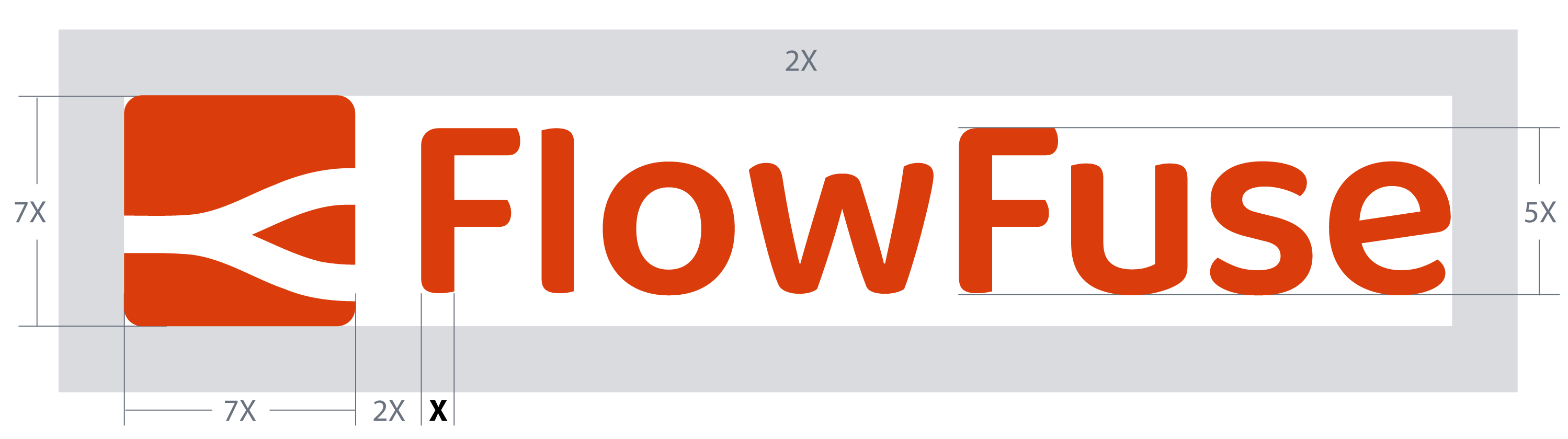
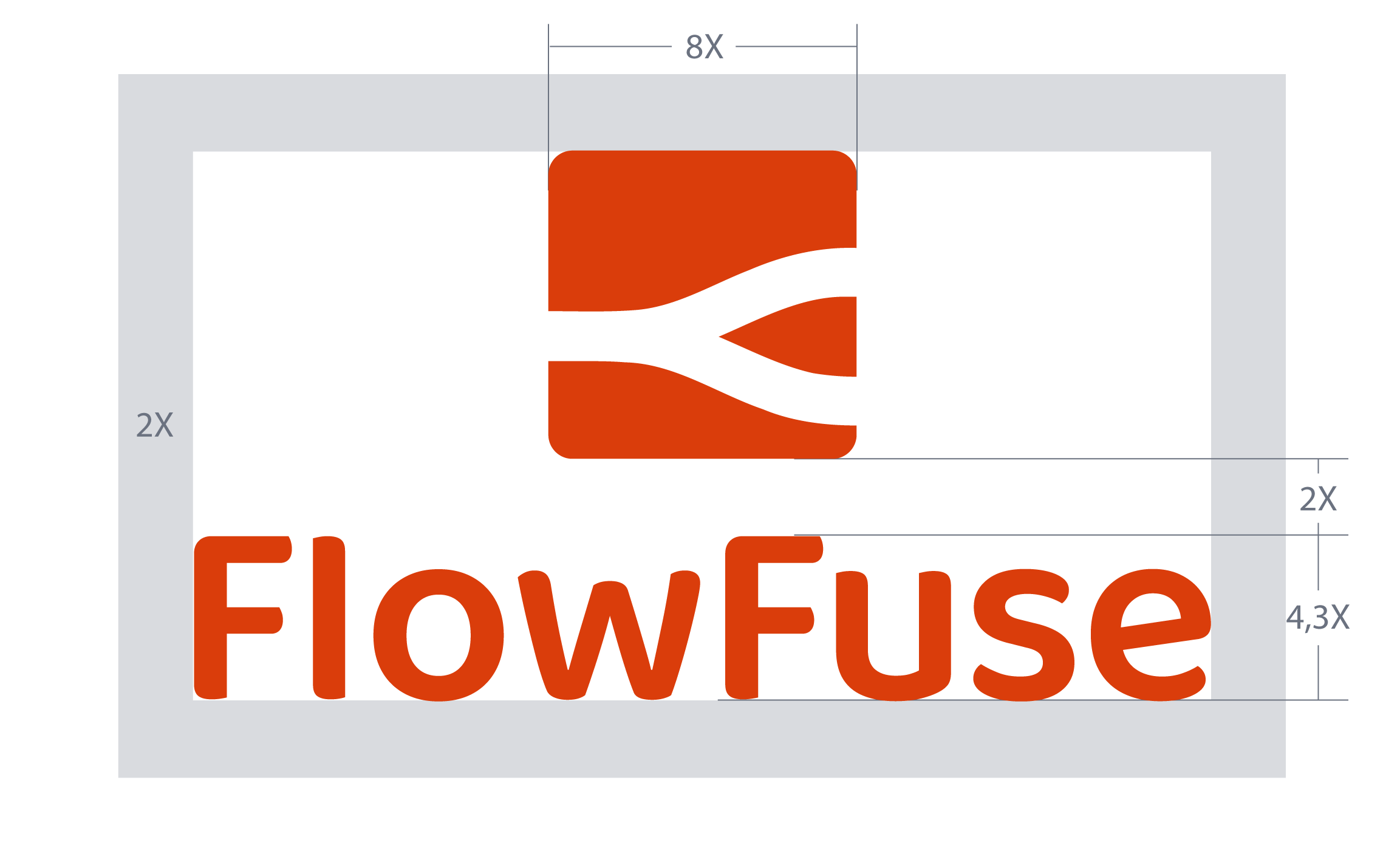
Construction and correct usage
The order, distance, and proportion of the elements composing the combination mark must not be altered in any way.
A safety area of 2X is defined to ensure proper image usage and readability.
Construction of Horizontal Version
Construction of Vertical Version
Chromatic Versions
Depending on the background against which the logo is presented, there are corresponding versions to be used.
Dark Backgrounds
Search for the file name ending with "dark", such as: ff-logo--wordmark--dark.png
Light Backgrounds
Search for the file name ending with "light", like: ff-logo--wordmark--light.png
Please note that the dark background version consists of two colors, while the remaining versions consist of a single color.
Monochromatic
When only black or white are allowed, search for the file name ending with "black" or "white". For instance: ff-logo--wordmark--white.png
Fonts
The following fonts are used across the FlowFuse platform, website, and branded materials. The table below outlines where each font is applied.
| Font | Logo | Platform | Website | Branded Materials |
|---|---|---|---|---|
| font-sans (Tailwind CSS) | * | |||
| Heebo | * | * | ||
| Baloo Da 2 | * |
Notes:
- Heebo: When using this font, we aim to avoid weights heavier than semi-bold to maintain a clean and balanced design.
- Baloo Da 2: Exclusively used in the FlowFuse logo.
Color Palette
Black
#000000
White
#FFFFFF
Grey 50
#F9FAFB
Grey 100
#F3F4F6
Grey 200
#E5E7EB
Grey 300
#D1D5DB
Grey 400
#9CA3AF
Grey 500
#6B7280
Grey 600
#4B5563
Grey 700
#374151
Grey 800
#1F2937
Grey 900
#111827
Red 50
#FFE8E5
Red 100
#FFBFB5
Red 200
#FF8A7B
Red 300
#FF604F
Red 400
#FF3B27
Red 500
#FF2400
Red 600
#DA3D0B
Red 700
#B32E09
Red 800
#8D1F06
Red 900
#671506
Indigo 50
#EEF2FF
Indigo 100
#E0E7FF
Indigo 200
#C7D2FE
Indigo 300
#A5B4FC
Indigo 400
#818CF8
Indigo 500
#6366F1
Indigo 600
#4F46E5
Indigo 700
#4338CA
Indigo 800
#3730A3
Indigo 900
#312E81
Blue 50
#EFF6FF
Blue 100
#DBEAFE
Blue 200
#BFDBFE
Blue 300
#93C5FD
Blue 400
#60A5FA
Blue 500
#3B82F6
Blue 600
#2563EB
Blue 700
#1D4ED8
Blue 800
#1E40AF
Blue 900
#1E3A8A
Text Color & Contrast
WCAG 2.1 AA requires a contrast ratio of at least 4.5:1 between normal-size body text and its background (large text — 18pt or larger, or 14pt bold — requires 3:1; see Success Criterion 1.4.3). Several values in the grey scale above look similar but sit on opposite sides of that threshold, so choose by background:
| Background | Minimum grey for normal text | Notes |
|---|---|---|
White (#FFFFFF) | Grey 500 (#6B7280, 4.83:1) | Minimum for normal text. Site body copy uses Grey 700 (#374151, 7.56:1); Grey 500 is used for bolded prose text and for secondary metadata like dates, bylines, and captions |
Grey 50 / Grey 100 (bg-gray-50, bg-gray-100) | Grey 600 (#4B5563) | Grey 500 produces only ~4.3:1 on Grey 100, below AA |
Indigo 50 (bg-indigo-50) | Grey 600 | Tinted background reduces effective contrast against mid-greys |
| Dark backgrounds (Grey 600+) | Grey 300 or lighter, or white | Light values required to reach 4.5:1 |
Grey 400 (#9CA3AF) fails AA for normal text on any light background (≈2.85:1 on white). Reserve it for:
- Decorative, non-text elements (icons, dividers, tree-branch characters), where the 3:1 non-text contrast rule applies
- Intentional placeholder or disabled states where the reduced contrast is the intended signal — for example, unconfirmed talks on an event schedule, inactive form fields, or greyed-out menu items. Document the intent inline so future edits preserve it.
When in doubt, run the page through Lighthouse and check the color-contrast audit before shipping.
Lighthouse (built into Chrome DevTools): open the page → DevTools (⌘⌥I / F12) → Lighthouse tab → tick Accessibility → Analyze page load. Scroll to "Contrast" in the report — any failing element is listed with its selector and the actual ratio.
For a one-off spot-check without running a full audit, the WebAIM Contrast Checker takes two hex values and returns the ratio.
Iconography
All app and site iconography uses Heroicons, by the makers of Tailwind CSS. Within our flowforge app, we have two icon sizes available which can be assigned with ff-icon and ff-icon-sm.
Branded Templates
Email Signature
Using a consistent email signature helps people outside FlowFuse understand who we are and what we do. Including your job title gives context to your role, and the link to our website makes it easy for recipients to learn more about us. It also reinforces our brand and makes every interaction look professional and cohesive.
When to use your signature
Always include it in external emails (clients, partners, vendors, community members) and when starting or joining a new email thread. For ongoing replies within the same thread, it's optional. Many email clients have settings to automatically include your signature only in new emails, which can help streamline this.
Gmail (Browser)
If you're using Gmail in your browser:
- Go to flowfuse.com/email-signature/
- Copy the signature displayed on the page
- Paste it into your Gmail signature settings following these instructions
- Update the placeholder text with your personal information
Apple Mail
If you're using the Apple Mail app, you can follow this video tutorial which covers most of the steps below. The main difference is that we're providing you with the signature code directly, so you can skip the HTML generation part.
Here are the detailed steps:
- Create a new signature following these instructions. Name it and leave it empty. If any content is added automatically, delete it. Close the Mail app.
- In Finder, go to the menu bar and select Go > Go to Folder, then enter:
~/Library/Mail - Navigate to the folder that starts with "V" followed by a number (this indicates your Mail version and will vary by user), then go to MailData > Signatures.
- Find the file with the
*.mailsignatureextension and open it in a text editor. - Replace everything below the line
Mime-Version: [version]with the code from email-signature.njk. - Save the file, then press Command + I to open the Info window and check Locked.
- Reopen the Mail app, return to the Signatures menu, and edit the placeholder data with your personal information.
Your signature is now ready to use.
Note: Please preserve the typography, colors, and formatting in the signature template to maintain brand consistency.
Presentations
There's a branded theme for Google Slides presentations available in the FlowFuse template gallery. To access it, you need to be logged in to your FlowFuse account. Look for a theme called "FlowFuse Template".
When you click on it, two things will happen:
- A new Google Slides file will be created in your Drive with the theme applied.
- The file will open for editing.
You'll find a fully designed presentation as an example of how to use different layouts. To explore all the predefined options available, check the Layout menu.
Feel free to edit the content, delete or add slides as needed. Any changes you make will only affect your copy in your Drive.
Letterhead
A branded Google Docs letterhead is also available in the FlowFuse template gallery, titled "FlowFuse Letterhead – Template." Make sure you're logged into your FlowFuse account to see it.
Clicking the template will create an editable copy in your Drive — just like with the presentation template. You can customize this copy freely without affecting the original.
Note: Both templates include predefined typography, colors, and margins. Please preserve these elements to maintain consistency across all branded materials.
Video Call Backgrounds
As part of our design assets, we have branded images in our company drive that can be used as backgrounds for video calls. Both regular and mirrored versions are available to suit the platform and view mode you have set up.