Creating REST API's with Node-RED
REST APIs are how applications talk to each other over the web. They use standard HTTP methods (GET, POST, PUT, DELETE) to send and receive data, usually in JSON format. This guide shows you how to build your own REST APIs in Node-RED and how to pull data from existing APIs.
Creating a GET API
- Drag an "http-in" onto the workspace, double click on it and select the Method to for which operation you need, set URL endpoint.
- Drag an chagne node onto the workspace and set the
msg.payloadto data you want to send as response. - Then Drag an http response node, in it and set the status code if want.
- Connect the "http-in" node's output to the input of the function node and the function node's output to the input of the http response node.
Creating a POST, PUT, and DELETE API
- Drag an "HTTP In" node onto the workspace. Double-click on it and select the desired method (POST, PUT, DELETE).
- Add a node to the canvas based on your application's needs. For example, if you've selected DELETE, you may use a Change node to perform operations to delete data stored in Node-RED context. Set
msg.payloadto the response data you want to send, make sure the msg.payload is originated from "http-in" node. - Drag an "HTTP Response" node onto the workspace. Configure it and set the status code if needed.
- Connect the output of the "HTTP In" node to the input of the node handling your application logic (e.g., Change node for DELETE operation). Then, connect the output of this node to the input of the HTTP Response node.
For more details, refer to the CRUD API Blueprint, where we have created CRUD APIs to store, retrieve, delete, and update the data from MongoDB database.
Securing Your APIs
APIs without security are open doors to your application. Here are essential practices for protecting your endpoints:
Authentication
The simplest approach is HTTP Basic Authentication. Add authentication to your http-in nodes:
- Open your http-in node
- Enable "Use authentication"
- Set a username and password
Node-RED will reject requests without valid credentials. For production systems, consider more robust options like:
- API Keys: Send a secret key in headers that your flow validates
- OAuth 2.0: Industry-standard authorization for third-party access
- JWT Tokens: Stateless authentication tokens that carry user information
Rate Limiting
Prevent abuse by limiting how often someone can hit your endpoints. Use the node-red-contrib-rate-limit node to throttle requests:
npm install node-red-contrib-rate-limit
Place it after your http-in node to block excessive requests from the same source.
HTTPS Only
Never expose APIs over plain HTTP in production. Always use HTTPS to encrypt data in transit. If you're using FlowFuse, HTTPS is handled automatically. For self-hosted instances, configure Node-RED behind a reverse proxy (nginx, Apache) with SSL certificates.
Input Validation
Always validate incoming data. Don't trust anything users send:
// In a function node
if (!msg.payload.id || typeof msg.payload.id !== 'string') {
    msg.statusCode = 400;
    msg.payload = { error: "Invalid ID" };
    return msg;
}
Check data types, required fields, and acceptable values before processing.
CORS Configuration
If your API is called from web browsers, configure CORS properly. Add an http response node and set headers:
Access-Control-Allow-Origin: https://yourdomain.com
Access-Control-Allow-Methods: GET, POST, PUT, DELETE
Access-Control-Allow-Headers: Content-Type, Authorization
Never use * for Allow-Origin in production—specify exact domains.
Example: Reading Data
Now that you've learned how to create REST APIs in Node-RED, let's explore an example of reading data using a HTTP GET request. This example will demonstrate how to fetch data from an external API and process it and display on dashboard chart.
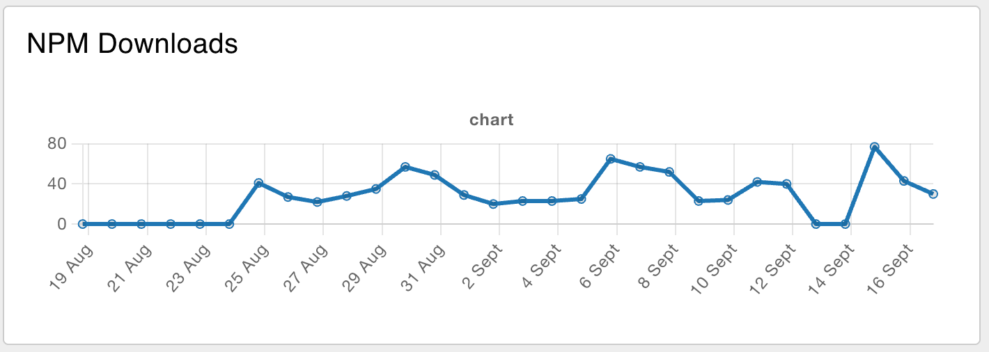
For the example we will fetch the data of Node-RED Dashboard 2.0 Downloads from npm registry api.
https://api.npmjs.org/downloads/range/last-month/@flowforge/node-red-dashboard.
A simple flow to fetch data from npm registry would be:
Where we paste the API URL into the settings panel:

When running this flow you'll see a blob of text in the Debug pane. This is a great first start, but a blob isn't useful for the rest of the flow.
We need to parse the data as JSON. While the JSON node
would work, the HTTP request node can do this natively. Let a parsed JSON object
the Return settings of the HTTP request node.
So now we got the data, and a little more than we need, so let's change the message output to keep only what we're interested in; payload.downloads. To do this, we'll use the change node.

Building the Dashboard
Follow the Dashboard getting started guide to get up and running.
Now we drag in the chart node that's available after installing the dashboard package and make sure it' input comes from the configured change node. Before hitting the deploy button the dashboard itself needs configuring:
First add configuration for the ui-group: 
To setup the ui-group correctly you'll need to add configuration for the ui-page: 
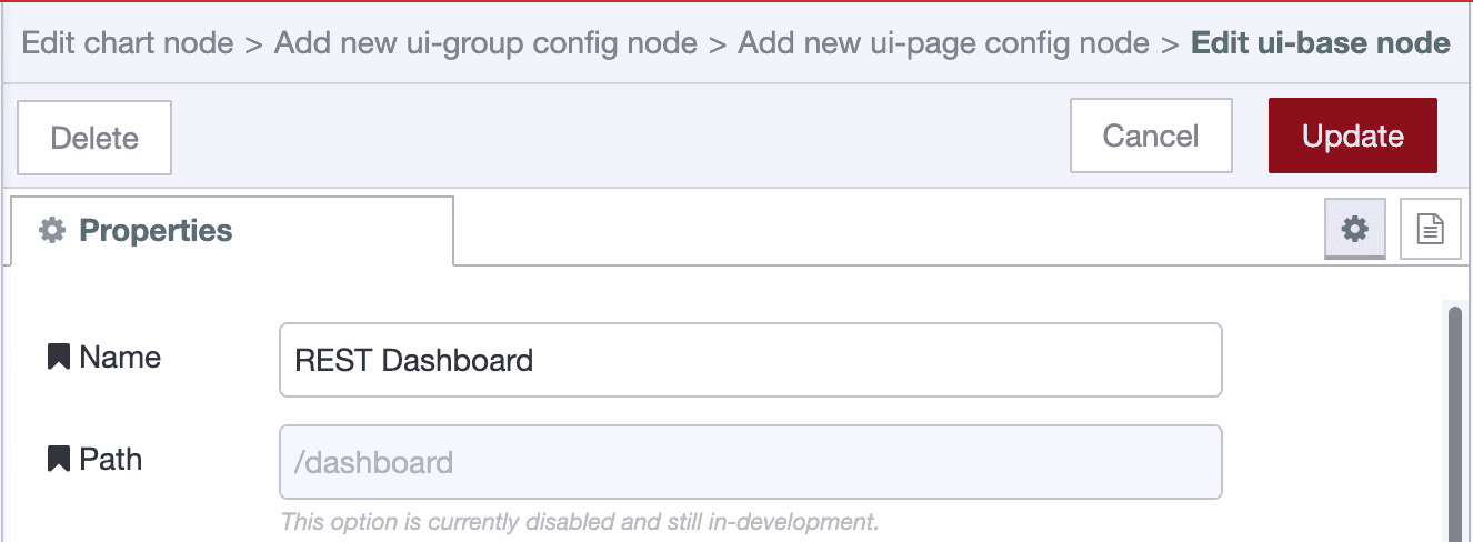
To create the UI page it requires another 2 config settings, ui-base, and the theming through ui-theme.
The default theme is great, so just accept that, and save all dialogs to continue the chart creation.
Normalizing the data
The data for the chart needs to be changed before we can show it. The messages should have a x and y key. So let's prepare the data with a combination of the Split and change node.
The Split node with the default configuration allows to 30 elements of the array to be mapped individually. The change node will set the payload.x and payload.y
on the message:

Connect the change node output to a new chart node, and voila:
Keeping the data up-to-date
While we created a chart and it has some data, there's one more thing to explain. How can the data be kept up-to-date? It's straight forward to have the Inject
node run every night, but the chart would now have multiple data points for the same day. This paints multiple lines on top of each other. While that works, the hover of the chart will display the duplication and it's wastefull.
So before we update the chart we need to send a message to the chart where the
payload is []. That way the chart is emptied first, and right afterwards it will receive the new data to write.