Getting Started with Node-RED Dashboard 2.0
New to Node-RED? New to Dashboard 2.0? This guide will help you get started.
This getting-started guide walks new and experienced Node-RED users through installing FlowFuse Dashboard 2.0 and building their first dashboard. It covers installing the package via the Palette Manager, adding widgets to a canvas, and understanding the core building blocks ui-base, ui-page, ui-group, and ui-theme.
With our latest release of Node-RED Dashboard 2.0, we've made some big improvements to the onboarding experience.
We're seeing over 2,000 people download Dashboard 2.0 per week, and are seeing a great buzz in the community of brand new Node-RED users, experienced Node-RED users that haven't explored a UI solution previously and existing users migrating from Dashboard 1.0.
So, with that in mind, we wanted to offer a new "Getting Started" guide that will help you get up and running with building custom user interfaces and data visualizations in Node-RED.
How to Install Node-RED Dashboard 2.0
Step 1: "Manage Palette"
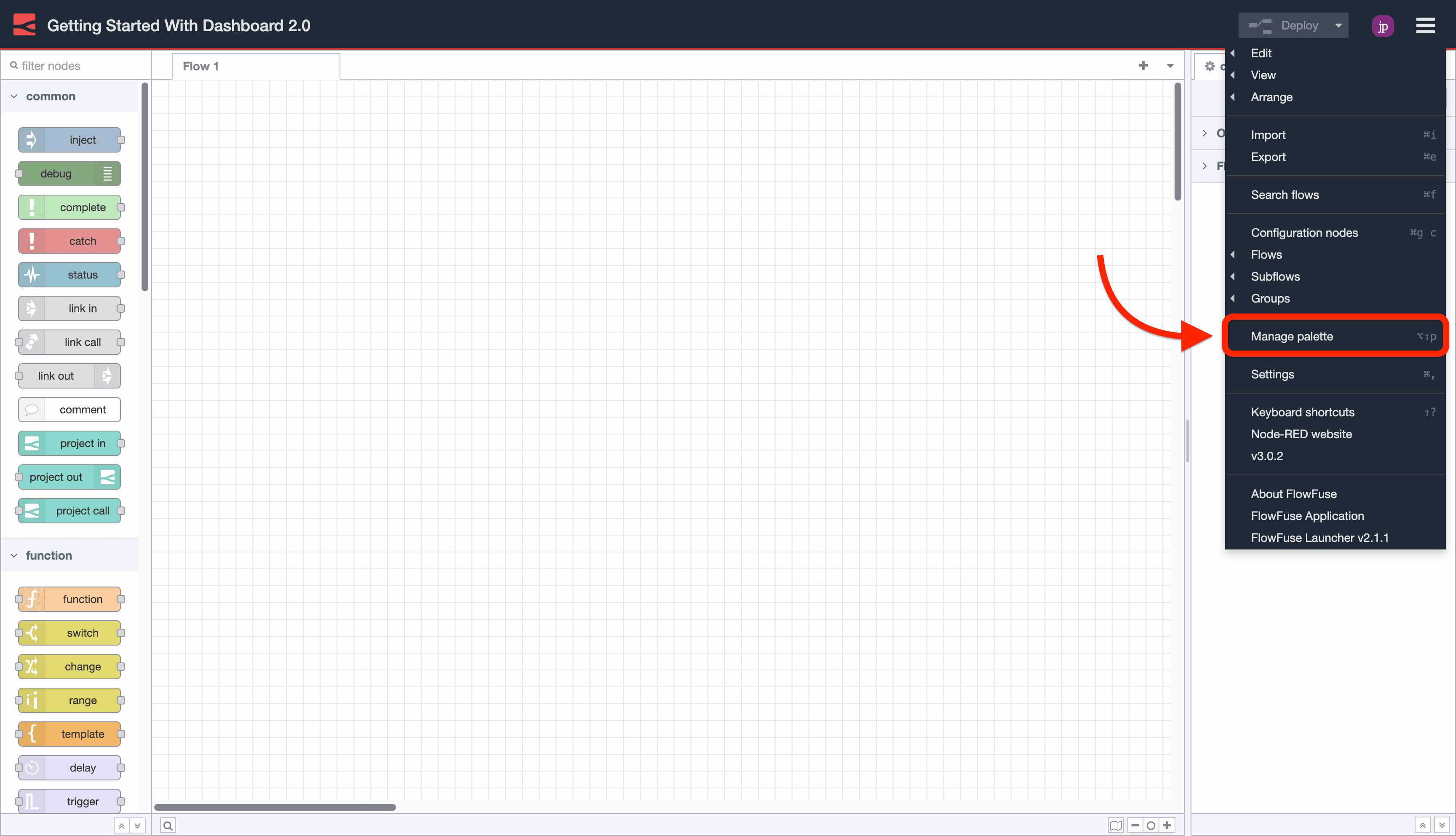
- Click the Node-RED Settings (top-right)
- Click "Manage Palette"
Step 2: Search & "Install"
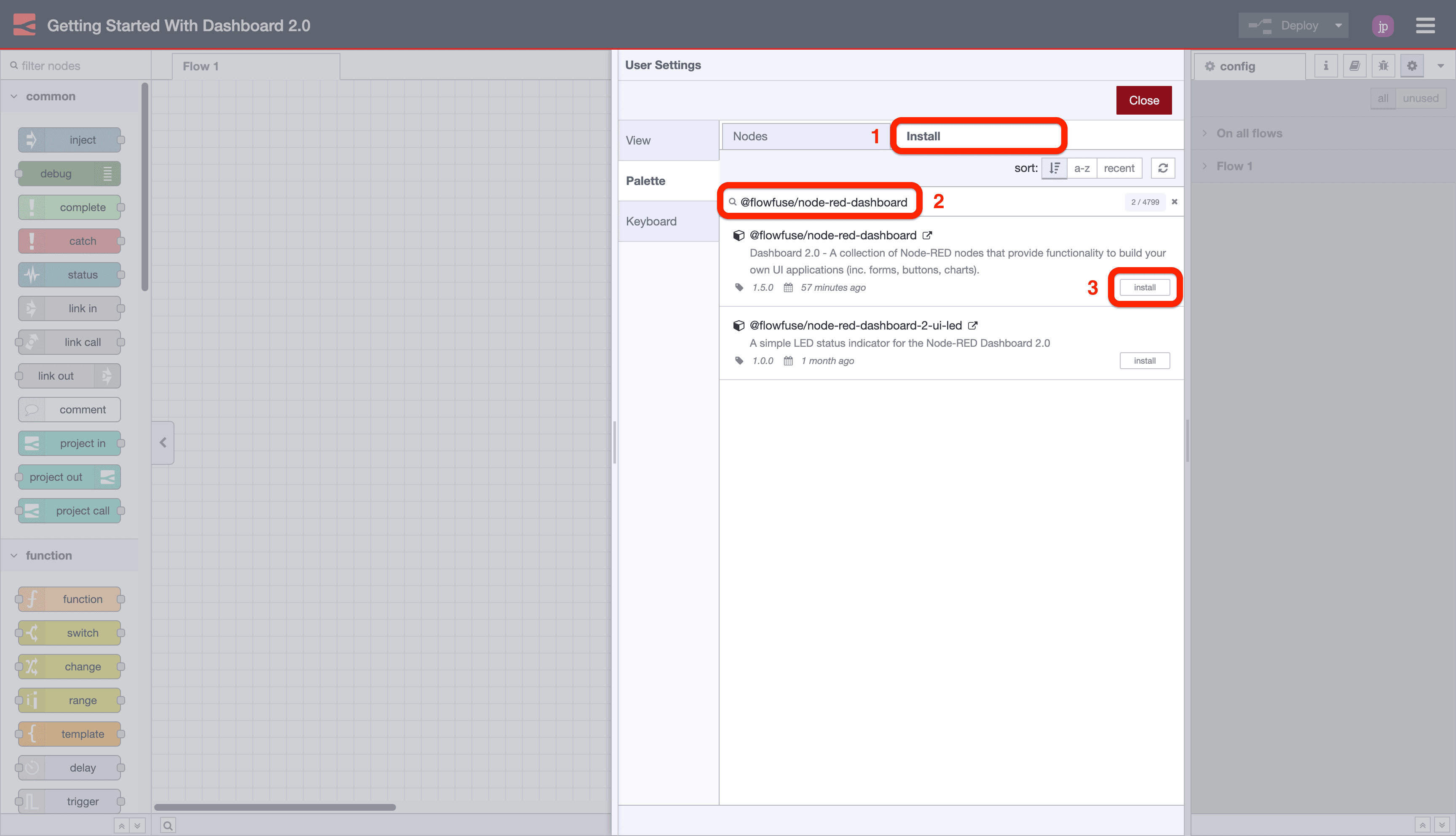
- Switch to the "Install" tab
- Search for "@flowfuse/node-red-dashboard"
- Click "Install"
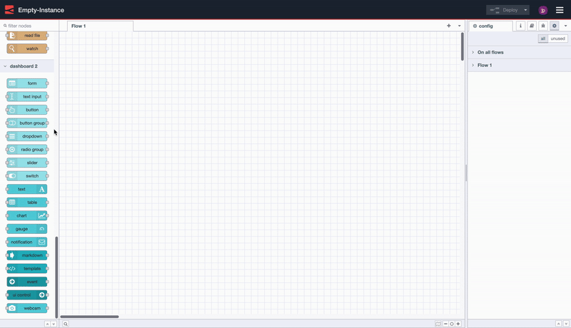
Adding your first widgets
With the nodes installed, getting started is as easy as choosing a node from the Palette (the left-hand side list of nodes) in Node-RED, and dropping it onto your canvas.
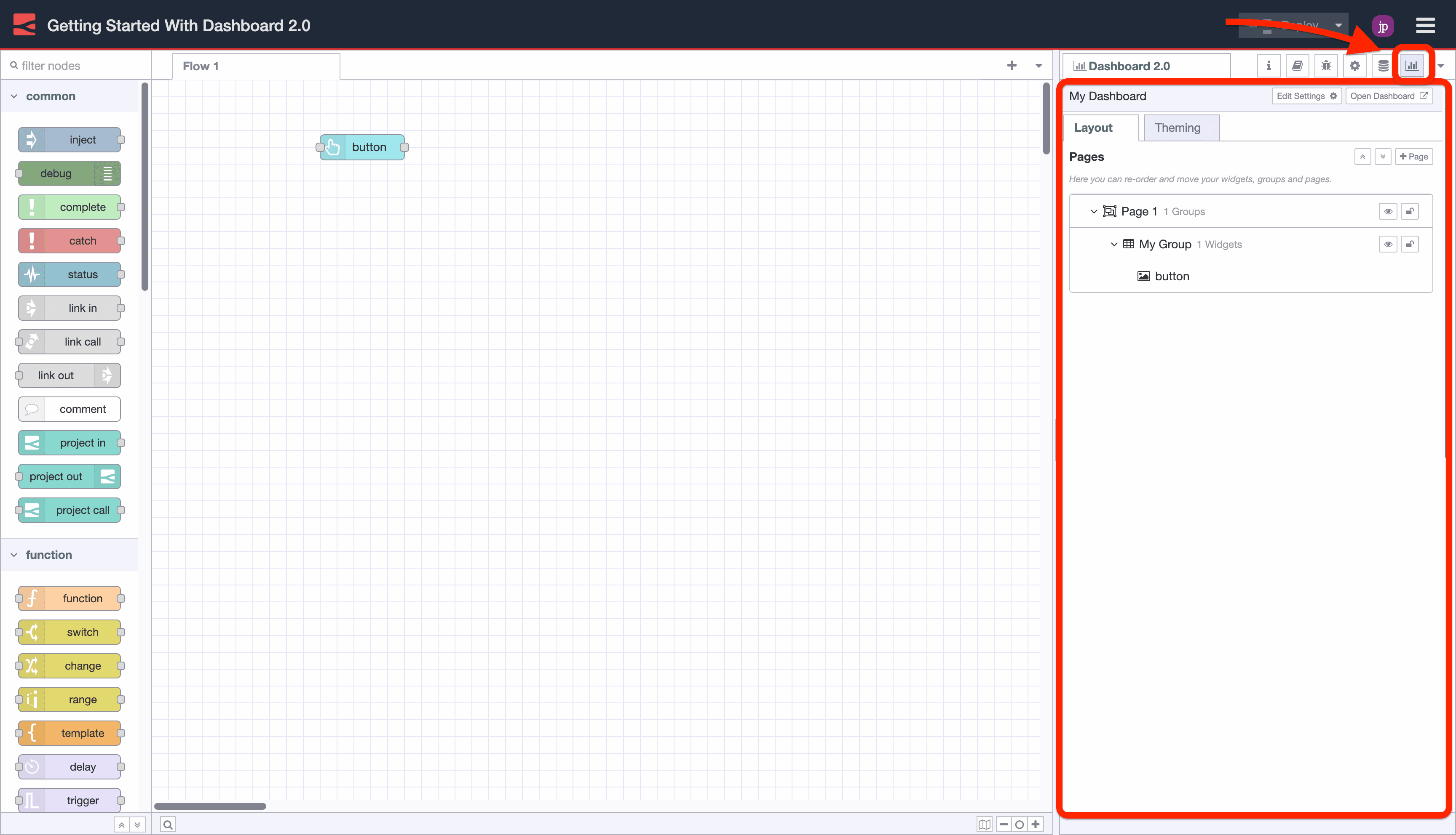
In this case, we drop in a ui-button, click "Deploy" and then can see the button running live in our user interface.
Notice too that Dashboard will automatically setup some underlying configurations for you (visible in the right-side menu):
ui-base: Each instance of Node-RED that uses Dashboard 2.0 must have a singleui-baseelement (we're hoping to add support for multiple in the future). This element contains all of the global settings for your Dashboard instance.ui-page: A single Dashboard (ui-base) can consist of multiple pages, and can be navigated to using the left-side sidebar. Each page is then responsible for displaying a collection ofui-groupelements.ui-group: Each group contains a collection of widgets, and can be used to organize your Dashboard into logical sections.ui-theme: Eachui-pagecan be assigned a given theme. Your "Themes" provide control over the aesthetic of your Dashboard like color, padding and margins.
Configuring your layout
Dashboard 2.0 adds a dedicated sidebar to Node-RED to provide a centralized view of your pages, groups and widgets. From here you can add new pages and groups, modify existing settings, and re-order content to your liking.
When defining your layout options, we break the choice into two sections:
- Page Layout: Controls how the
ui-groups's are presented on a given page in your application. - Navigation Sidebar: Defines the left-side navigation style, defined at the
ui-baselevel.
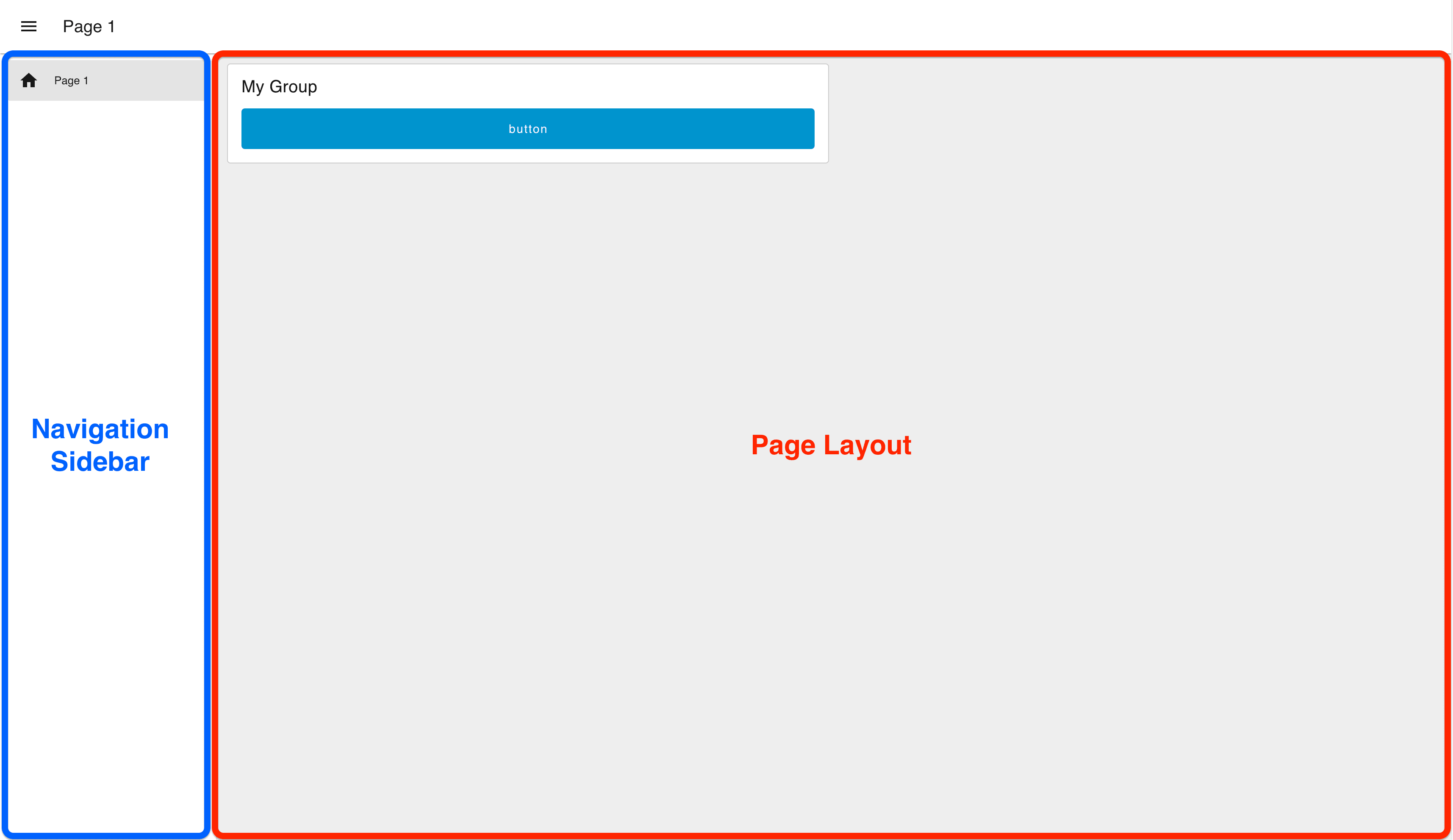
Page Layout
Currently, we have three different options for page layout:
- Grid: (docs) This is the default layout for a page, and uses a 12-column grid system to layout your
ui-groups. Widths of groups and widgets define the number of columns they will render in. So, a "width" of 6" would render to 50% of the screen. Grid layouts are entirely responsive, and will adjust to the size of the screen. - Fixed: (docs) Each component will render at a fixed width, no matter what the screen size is. The "width" property is converted a fixed pixel value (multiples of 48px by default).
- Notebook: (docs) This layout will stretch to 100% width, up to a maximum width of 1024px, and will centrally align. It's particularly useful for storytelling (e.g. articles/blogs) or analysis type user interfaces (e.g. Jupyter Notebooks), where you want the user to digest content in a particular order through scrolling.
Navigation Sidebar
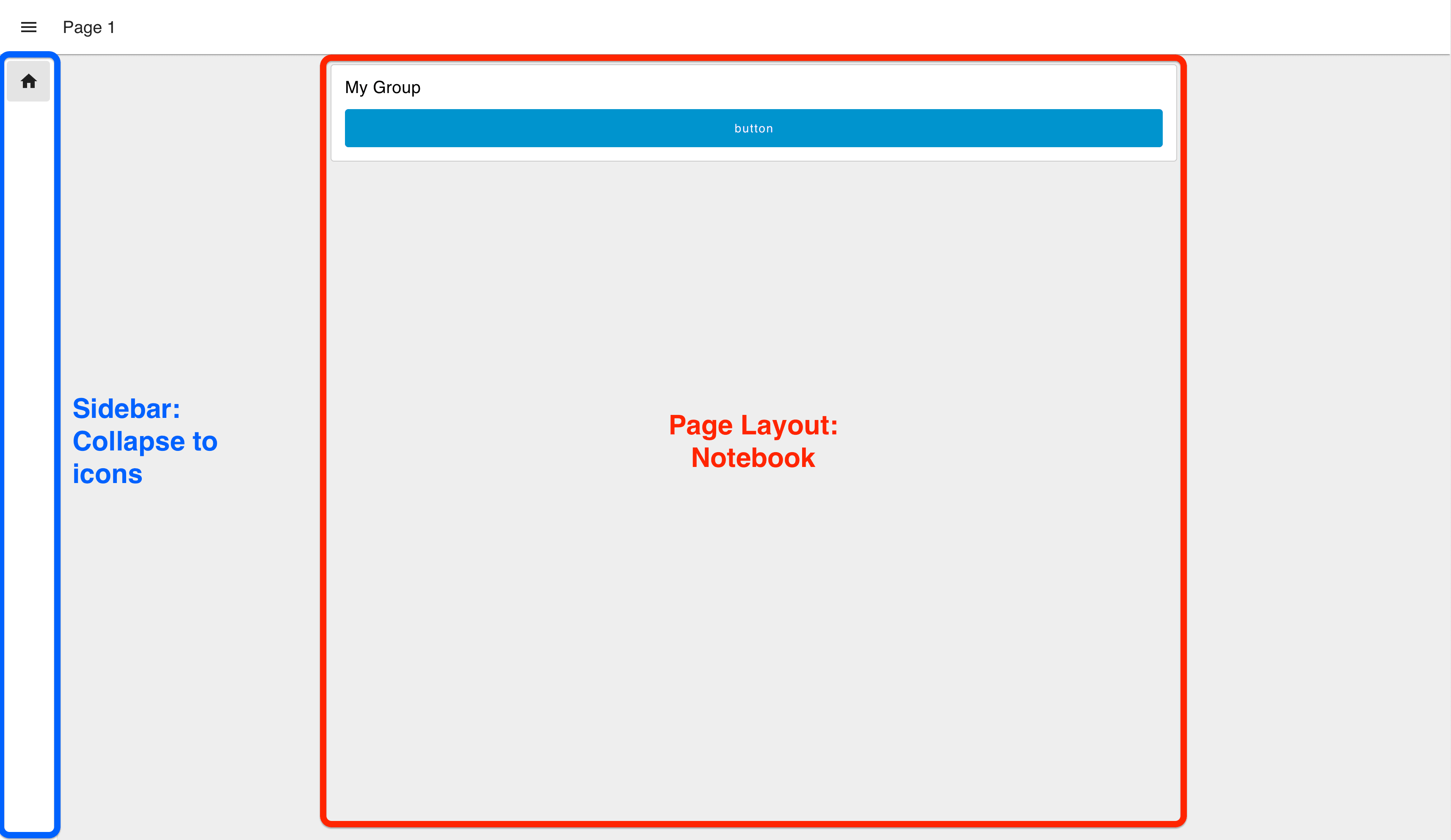
Dashboard 2.0 offers various options on the appearance of the navigation sidebar:
- Collapsing: When the sidebar is opened the page content will adjust with the width of the sidebar.
- Fixed: The full sidebar will always be visible, and the page content will adjust to the width of the sidebar.
- Collapse to Icons: When minimized, users can still navigate between pages by clicking on the icons representing each page in the sidebar.
- Appear over Content: When the sidebar is opened, the page is given an overlay, and the sidebar sits on top.
- Always Hide: The sidebar will never show, and navigation between pages can instead be driven by
ui-control.
Define Your Layout
In our example, we're going to switch to a "Notebook" layout, with a "Collapse to Icons" sidebar:
Adding More Widgets
Now, we're going to build a quick example to demonstrate how we can wire nodes together, and visualize the output from a ui-slider onto a ui-chart.
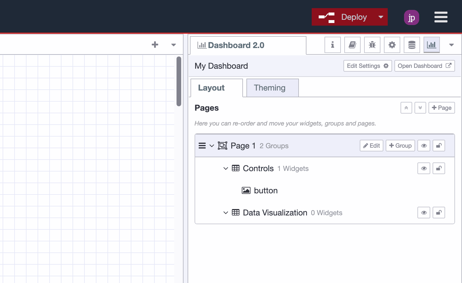
Adding a Group
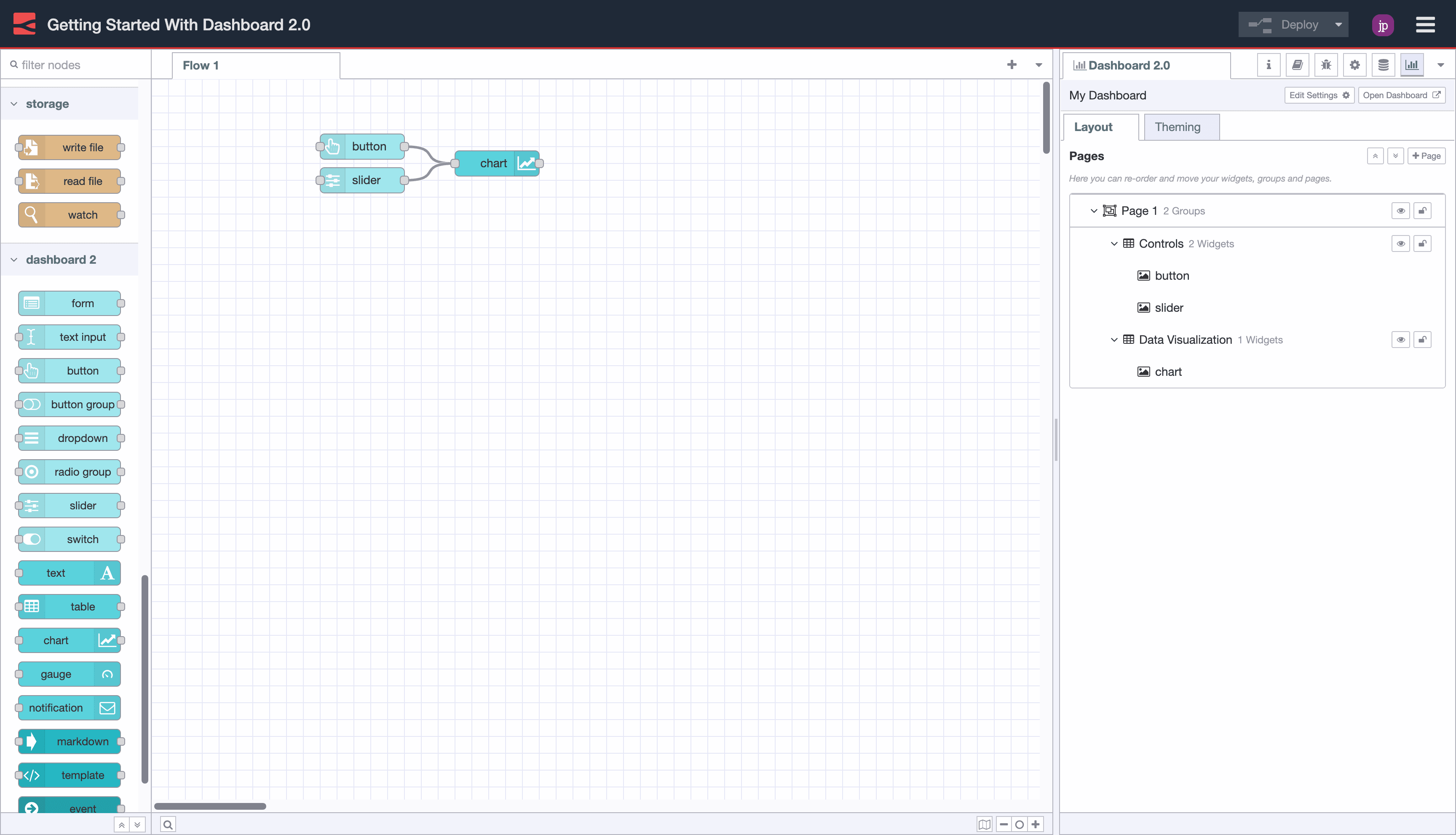
In the Node-RED Editor's Dashboard 2.0 sidebar, we're going to then do the following things:
- Edit "My Group" and rename it to "Controls"
- Create a new "Group" in your existing page called "Data Visualization"
You'll now see the two groups listed under "Page 1". "Controls" with a single ui-button and "Data Visualization" with no widgets.
Connecting New Nodes
Then, we're going to add two new widgets:
- UI Chart
- UI Slider
Which we can do by dropping them from the left-side Palette and onto our canvas.
We'll need to double-click each new node and confirm which "Group" we want to add this node to. In this case, we'll add the ui-slider to the "Controls" group, and the ui-chart to the "Data Visualization" group.
We're also going to connect the output from both the ui-slider and ui-button to the input of the ui-chart:
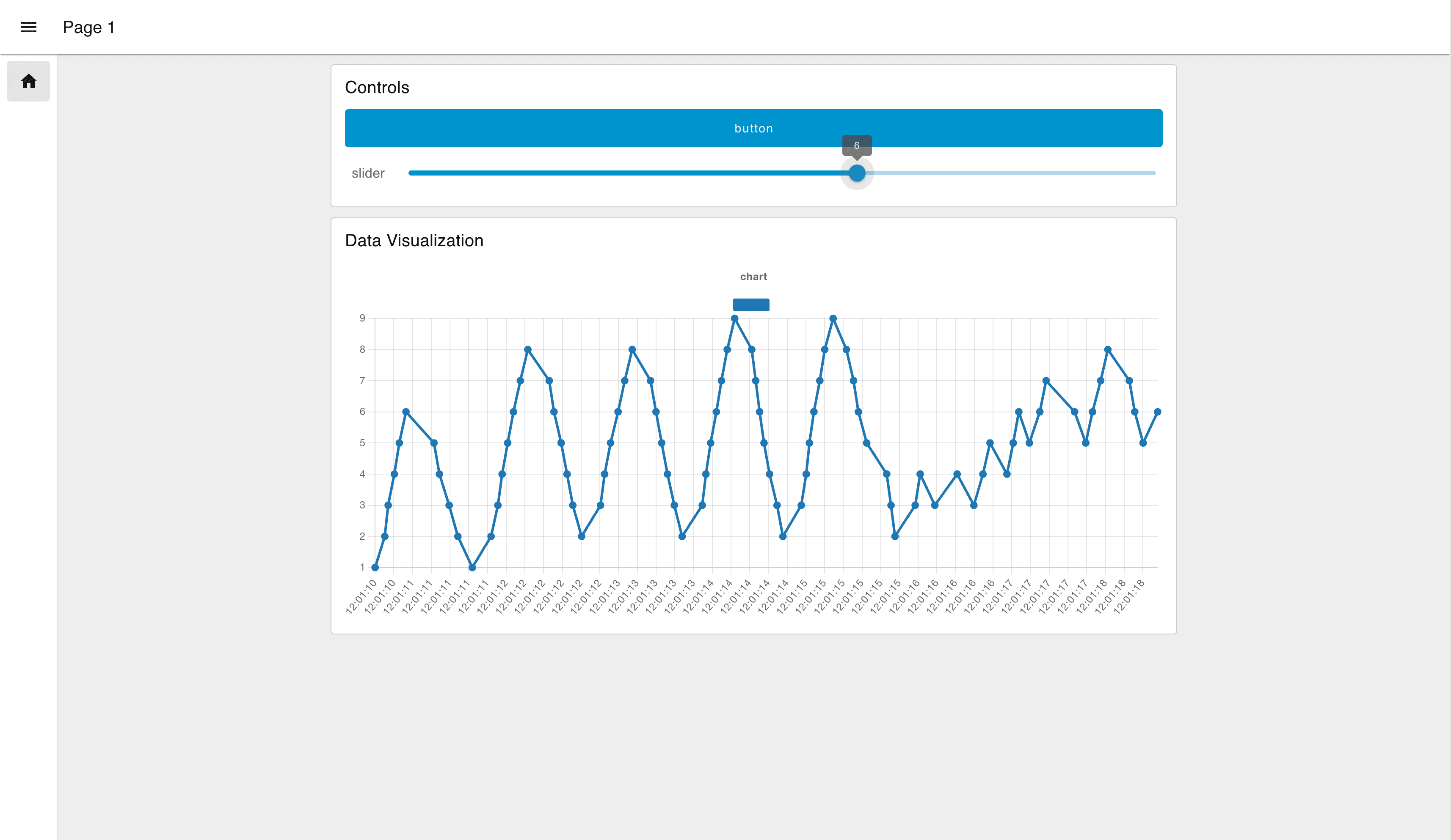
Now, when we view our Dashboard, we can see the ui-slider output is def straight into our ui-chart:
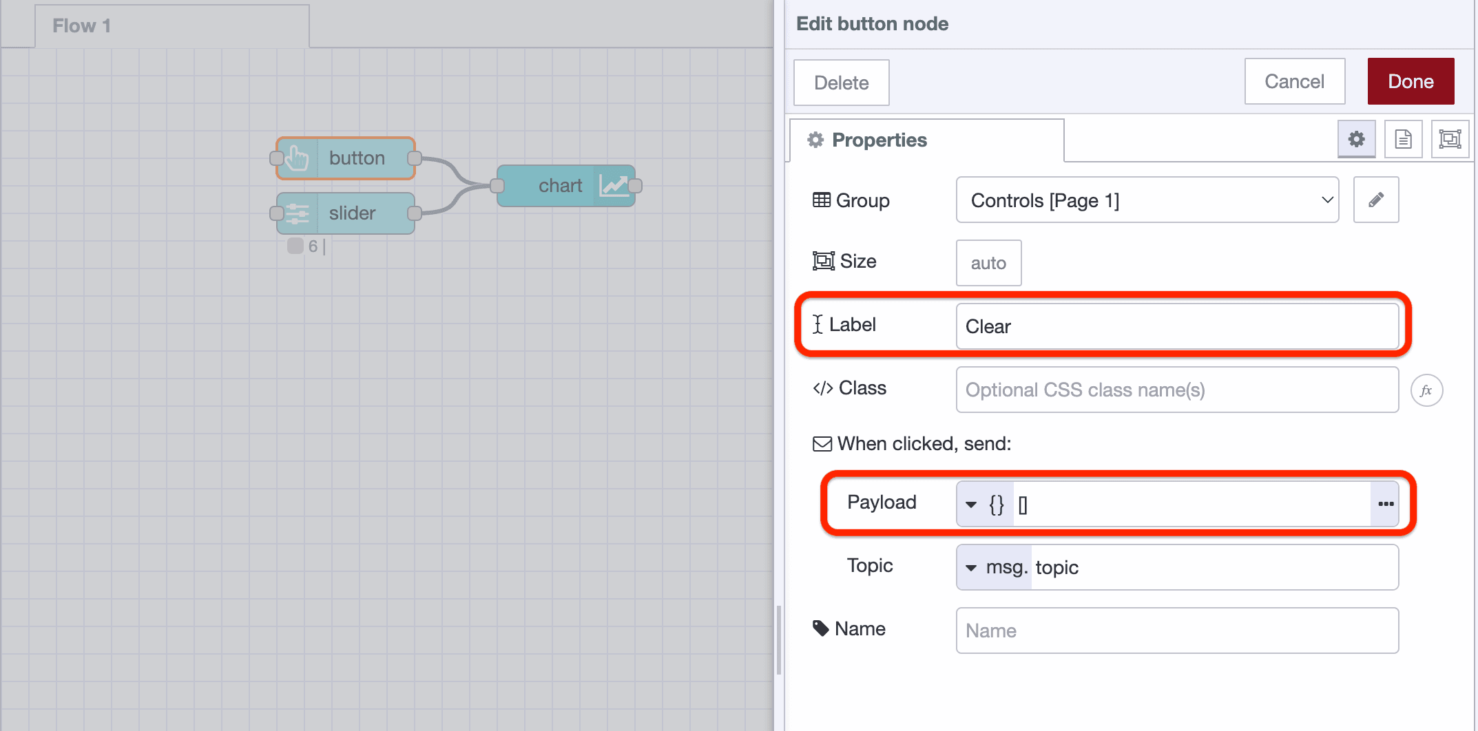
The final step we're going to make is to modify our ui-button. We're going to rename it to "Clear", and configure it's "Payload" option to send a JSON payload of [], which, when sent to the ui-chart will clear the chart of all data.
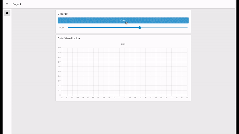
With all of this together, we have the following functional Dashboard:
Next Steps
Whilst this is just a simple introduction of Node-RED Dashboard 2.0, we do have many other articles and documentation that can help you get started with more advanced features.
- FlowFuse Dashboard Articles - Collection of examples and guides written by FlowFuse.
- Node-RED Dashboard 2.0 Documentation - Detailed information for each of the nodes available in Dashboard 2.0, as well as useful guides on building custom nodes and widgets of your own.
- Node-RED Forums - Dashboard 2.0 - The Node-RED forums is a great place to ask questions, share your projects and get help from the community.
- Beginner Guide to a Professional Node-RED - A free guide to an enterprise-ready Node-RED. Learn all about Node-RED history, securing your flows and dashboard data visualization.
- FlowFuse - Book a Demo - FlowFuse provides a complete platform to scale your production Node-RED applications, increase developer velocity, and enhance security in order to accelerate innovation.
Follow our Progress
New features and improvements are coming to Node-RED Dashboard 2.0 every week, if you're interested in what we have lined up, or want to contribute yourself, then you can track the work we have lined up on our GitHub Projects:
If you have any feature requests, bugs/complaints or general feedback, please do reach out, and raise issues on our relevant GitHub repository.
Discuss your use case with our team
See how FlowFuse can support your architecture, integrations, and deployment needs.
About the Author
Joe Pavitt
Joe has been working with Node-RED for nearly 10 years, having worked with Nick O'Leary at IBM as a Master Inventor, and been one of the early developers working on the original Node-RED Dashboard. Since joining FlowFuse in 2022, Joe has become the lead for the FlowFuse Dashboard (Dashboard 2.0), created the Node-RED Academy and leads design and front-end development for FlowFuse.
Table of Contents
Like what you’re reading?
Add FlowFuse as a preferred sourceOn the page that opens, check the box next to flowfuse.com to see more of our articles in your Google Search results.
Recommended Articles:
- Ishikawa Fishbone Diagram: The 6Ms, Manufacturing Examples & Template
- Building Digital Work Instructions Dashboard for the Shop Floor
- Handling Clock Drift in Distributed Edge Devices
- Build a Defect Tracking and Quality Monitoring Dashboard
- Software-Defined Manufacturing: Improve Without Hardware Changes