Ishikawa Fishbone Diagram: 6Ms & Manufacturing Example
How a 60-year-old drawing still finds the root cause faster than most modern tools.

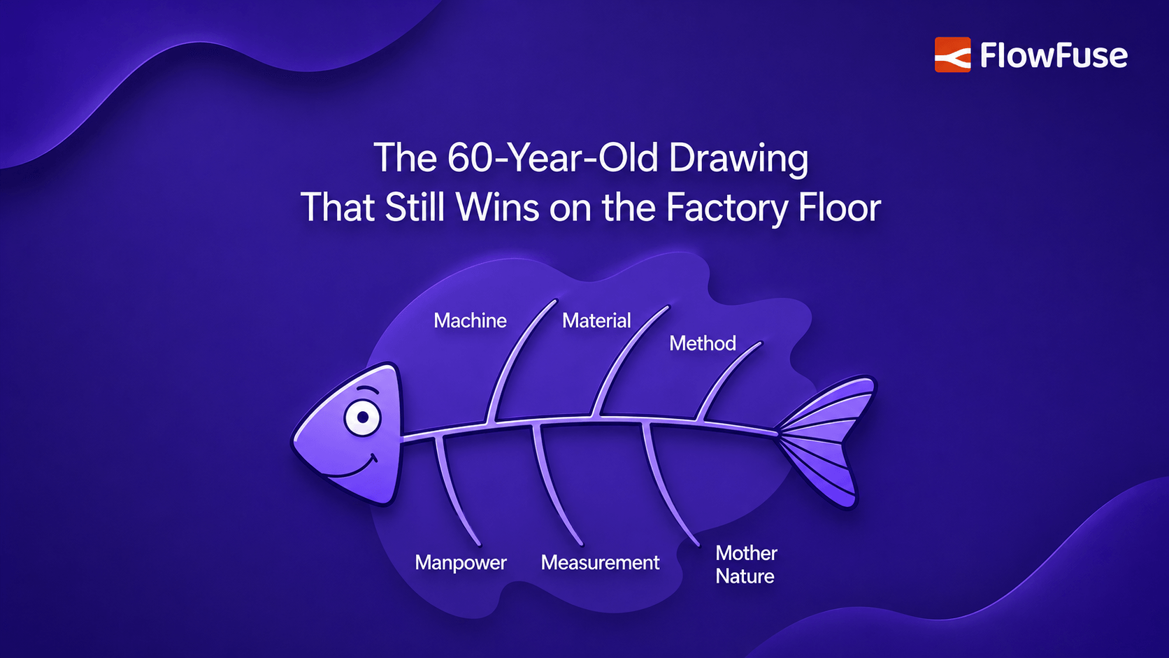
An Ishikawa diagram, better known as a fishbone or cause-and-effect diagram, finds the real cause of a problem instead of chasing symptoms by sorting possible causes into categories branching off a central spine. The 6Ms are a starting point for manufacturing, but you swap them for whatever fits your problem. It works because it forces a team to externalize and argue their theories on paper before spending money on a fix, and it fails when people stop at labeling empty branches and call that analysis. The diagram surfaces suspects; verifying which one is real, with data, is what actually fixes the problem.
The most dangerous words in a root cause investigation: "We already know what caused it." That confidence sends teams straight to a fix, and a few weeks later the same issue returns, because they fixed the symptom, not the cause.
Kaoru Ishikawa built a drawing in the 1960s to kill that reflex. It looks like a fish skeleton, and sixty years later engineers still reach for it first, because it forces every theory in the room onto one wall. It just doesn't tell you which one is guilty.
What Is a Fishbone Diagram?
Strip away the terminology and a fishbone diagram is a structured way to brainstorm causes without letting the loudest person in the room decide the answer.
You write the problem, the effect you want to eliminate, on the right side. That's the fish's head. A horizontal line runs left into it: the spine. Off that spine you draw diagonal branches, the ribs, and each rib is a category of causes. Under each category you hang the specific things that might be going wrong. When you're done, you're looking at every plausible cause for one problem, sorted into groups, on a single page.
The naming gets confusing, so here it is plainly. Ishikawa diagram, fishbone diagram, and cause-and-effect diagram all refer to the same tool. The names are used interchangeably in practice, though purists will point out that not every cause-and-effect sketch follows the fishbone shape. It's one of the seven basic quality tools, the club of simple techniques quality engineers lean on before pulling out anything statistical.
What it does not do is prove anything. A fishbone diagram generates hypotheses. It tells you where to look, not what the answer is. That distinction is the whole difference between a diagram that helps and one that wastes an afternoon, and we'll come back to it.
It's named after Kaoru Ishikawa (1915–1989), the Japanese engineer who popularized it in the 1960s while developing quality processes at the Kawasaki shipyards and formalized it in his 1968 book Guide to Quality Control. His aim was democratic: a diagram simple enough that any worker on the line could use it, not just a specialist team, which is why the American Society for Quality still lists it among the seven basic tools sixty years on. Its reach since has been broad, including Mazda, whose engineers reportedly used one to map every factor behind the "Jinba Ittai" feel of the original MX-5 Miata.
What Are the 6Ms in a Fishbone Diagram?
Ishikawa suggested generic labels for the rib categories so teams would have somewhere to start instead of staring at a blank spine. In manufacturing, those defaults became the 6Ms:
- Manpower (people): training gaps, unclear responsibilities, communication breakdowns, fatigue.
- Method (process): missing standards, steps performed inconsistently, procedures that no longer match reality.
- Machine (equipment): worn parts, skipped maintenance, wrong tooling, calibration drift.
- Material (inputs): out-of-spec raw material, supplier variation, wrong batch, storage damage.
- Measurement (data): miscalibrated instruments, wrong gauge, inconsistent inspection, bad data collection.
- Mother Nature (environment): temperature, humidity, vibration, dust, anything the surroundings do to the process.
Here is the part most guides bury: Ishikawa himself told people to rename these categories to fit their problem. The 6Ms are training wheels, not scripture. They map cleanly onto a factory floor, but even there you'll often want to tweak them, and outside a production line they can fall apart entirely.
Some teams add a seventh M, Money, when cost drivers matter. Process industries sometimes swap in categories like Environment, Equipment, and Procedures. For a service or business problem, the 7Ps (Product, Price, Place, Promotion, People, Process, Physical Evidence) fit better than machinery and materials. The right categories are the ones that make your team say "oh, we haven't thought about that bucket yet." If a category sits empty because it doesn't apply, delete it. An empty rib is not a sign you missed something; it's a sign the label was wrong for your problem.
How to Make a Fishbone Diagram
The mechanics take five minutes. Doing it well takes discipline. Here's the sequence.
- Write a problem statement, not a topic. "Machine downtime" is a topic. "Line 3 filler stops an average of 4 times per shift, each stop lasting 6 to 12 minutes" is a problem statement. The second one gives the team something specific to explain. Vague heads produce vague ribs.
- Draw the spine and pick your categories. Four to six is the sweet spot. Fewer and you're not really sorting; more and the diagram turns into a wall of branches nobody can read. Start from the 6Ms if you're in manufacturing, adapt hard if you're not.
- Brainstorm causes under each category. This is where the tool earns its keep. Go category by category and ask what, under this heading, could produce the effect. Write everything down, even the theories you doubt. The point of sorting into buckets is that it triggers ideas you'd never reach with an open-ended "what's wrong?"
- Push each cause deeper with "why." A first-level cause is rarely the root. Pair the fishbone with the 5 Whys: for each rib entry, ask why that happens, and hang the answer as a sub-branch. "Bearing failed" becomes "bearing failed → lubrication skipped → PM schedule not followed → no one owns the schedule." Now you're looking at a root, not a symptom.
- Then stop drawing and start verifying. This is the step that separates analysis from theater. A finished fishbone is a list of suspects, and every suspect is a hypothesis you can test against data. Circle the two or three most likely causes, then go check them: pull the maintenance log, measure the material, watch the operator. The diagram points the flashlight. It doesn't tell you what's in the dark.
Fishbone Diagram Example
Abstract diagrams teach nothing, so here's the kind of case that plays out on a real line. A packaging line is rejecting cartons because the printed date code is smearing. That's the head of the fish. The team runs 6M categories:
- Machine: print head height drifted, print head overdue for cleaning, conveyor speed increased last month.
- Material: new ink supplier introduced two weeks ago, carton stock switched to a glossier finish.
- Method: no standard for print-head-to-carton distance, cleaning interval never written down.
- Manpower: night shift not trained on the new ink's dry time.
- Measurement: no check on ink cure before cartons stack.
- Mother Nature: plant humidity up since the HVAC repair.
Six categories, roughly a dozen suspects. Now the 5 Whys on the strongest lead: the glossier carton stock. Why does gloss smear? Ink doesn't absorb. Why not? The new stock is non-porous. Why did we switch? Purchasing found a cheaper supplier. Why didn't anyone flag the print impact? No one owns print-compatibility sign-off on material changes.
Notice what happened. The obvious fix, "clean the print head," would have bought a day of relief and then the smearing returns. The fishbone surfaced two causes that interacted, a material change and a missing sign-off process, that a single-thread investigation would have walked right past. That's the entire value of the tool: it makes interacting causes visible instead of letting you commit to the first plausible one.
Fishbone vs. 5 Whys vs. Pareto: Which One, When
The fishbone rarely works alone, and it's easy to reach for the wrong tool. Here's how the three most common root-cause techniques divide the labor.
| Tool | What it does | Use it when | Where it falls short |
|---|---|---|---|
| Fishbone diagram | Goes wide. Surfaces every plausible cause across several categories so nothing obvious gets missed. | You don't yet know where the problem lives and want the team's collective knowledge on one page. | Treats every branch as equally worth investigating. Says nothing about which cause matters most. |
| 5 Whys | Goes deep. Drills a single cause chain, asking "why" until you hit something fixable rather than another symptom. | After the fishbone, on the two or three branches you think are strongest. | It's a single thread. Drill the wrong cause and you'll reach a confident, well-reasoned, wrong answer. |
| Pareto chart | Ranks. Sorts candidate causes by frequency or impact so you fix the vital few, not the trivial many. | You can count occurrences and need to decide where to act first. | Needs data you may not have early on, and only ranks what you already thought to measure. |
The sequence is: fishbone to find suspects, 5 Whys to reach the root of the best ones, Pareto to decide which roots are worth fixing first. They're not competitors. They're a pipeline. For a closer look at the first two, including when one is enough on its own, see our 5 Whys vs. fishbone diagram comparison.
Fishbone Diagram Template
Replace the six labels with categories that fit your problem, keep the problem statement specific, and treat every cause as something you'll later verify with data.
Our fishbone diagram template gives you a ready-made layout for the categories, causes, and verification, plus a worked example, so your team isn't drawing the fish from scratch each time.
Common Fishbone Diagram Mistakes
Most fishbone analysis sessions fail in a few predictable ways. Simply filling the branches with vague causes creates a diagram without useful analysis. Each cause should be specific enough to investigate and verify.
Another mistake is treating the fishbone diagram as the final answer. It identifies possible causes, but the team still needs evidence to confirm which cause actually contributed to the problem.
The 6Ms can also become a constraint when teams force every problem into the same categories. Use categories that fit the failure instead of filling branches that are not relevant.
A weak problem statement can make the entire analysis unfocused. Clearly define what happened, where it occurred, and how often before starting the analysis.
Finally, do not stop at the first obvious cause. "Operator error" or "machine failure" may only describe what happened. Continue asking why until you reach a specific, verifiable cause.
Where the Fishbone Fits
The Ishikawa diagram survives because it does one job well: it gets a group of people to externalize their theories, sort them, and argue about them on paper before spending money. It's cheap, it's visual, and it needs no training to read. Those are the same reasons the simplest tools tend to outlast the sophisticated ones.
It has limits. It shows causes but not their relative weight or how they interact over time; for that you'd reach for a Pareto chart, fault tree, or statistical analysis. And it's only as good as the verification that follows it. Draw the fish, then go prove which bone is broken.
Used that way, as a hypothesis generator that hands off to real investigation, it remains one of the fastest ways to stop treating symptoms and start fixing causes. Sixty years in, that's still a rare thing for a tool to do.
The catch is that verification needs data the whiteboard can't give you: how often the machine actually stalls, whether the material batch really shifted, what the sensor logged when the defect appeared. That's the step where FlowFuse fits, connecting your PLCs, sensors, and quality systems into dashboards so you can test which suspected cause is real and confirm the fix held. It won't draw the fishbone for you, but it settles which bone was broken.
Turn suspected causes into verified ones
Talk to our team about connecting your PLCs, sensors, and quality systems to FlowFuse, so you can verify which root cause is real with live production data and confirm your fixes actually hold.
Frequently Asked Questions
About the Author
Sumit Shinde
Technical Writer
Sumit Shinde is a Technical Writer at FlowFuse specializing in industrial automation and manufacturing. In the past three years, he has built industrial applications and authored more than 100 technical articles covering industrial connectivity, unified data architecture, production metrics, and quality management for modern manufacturing.
Like what you're reading?
Add FlowFuse as a preferred sourceOn the page that opens, check the box next to flowfuse.com to see more of our articles in your Google Search results.
Related Articles:
- A Control Plan Template Your Shop Floor Will Actually Use
- End of Line Testing: Your Final Defense Against Defects
- Quality Assurance vs Quality Control: Fixing the Process or Checking the Product
- Buyer's Guide: How to Evaluate an Edge AI Platform for Industrial Use
- CQI-9 Heat Treat Audit: A Drifting Thermocouple Can Fail the Whole Furnace