FlowFuse Dashboard 1.31.0: Five Themes for a Dark Mode Dashboard

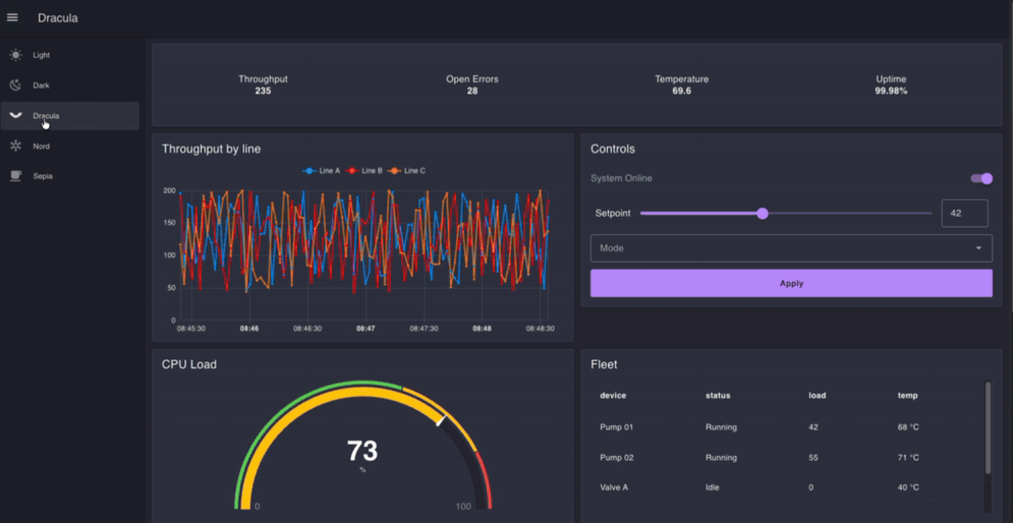
FlowFuse Dashboard 1.31.0 adds five built-in themes, giving you everything you need to build a dark mode dashboard, along with layout improvements for charts, buttons, and gauges. Previously, dark mode had contrast issues across widgets, charts collapsed to empty boxes at their default size, long button labels clipped mid-word, and gauges got sliced off by their own card.
This release ships alongside FlowFuse 3.0; see what else is new in that announcement.
What's new in FlowFuse Dashboard 1.31.0:
- Five built-in themes — Light, Dark, Dracula, Nord, Sepia — all WCAG AA contrast compliant
- Everything you need to build a dark mode dashboard: date pickers, charts, gauges, and icons all render legibly
- Charts draw at their default size; no more empty boxes on auto-height
- Long button labels wrap or truncate instead of clipping mid-word
- Gauges size and draw correctly on auto
- Table date/time columns render in the viewer's own local timezone
Node-RED Dashboard Themes: Build a Better Light & Dark Mode Dashboard with FlowFuse Dashboard
Choose from five built-in Node-RED Dashboard themes in FlowFuse Dashboard: Light, Dark, Dracula, Nord and Sepia. The selected theme applies across every page, group and widget.
Until now you got one white-and-blue default. Changing it meant hand-editing ten theme values, or writing CSS against Vuetify class names to reach anything the theme didn't expose.
If you built a dark mode FlowFuse dashboard before this release, native date and time pickers rendered black on black. Chart text sat at a contrast ratio you couldn't read across a desk. Icons stayed dark while the text around them flipped.
All five themes now meet WCAG AA contrast for text and icons. On the dark themes, date and time pickers, charts, gauges and markdown all render legibly.
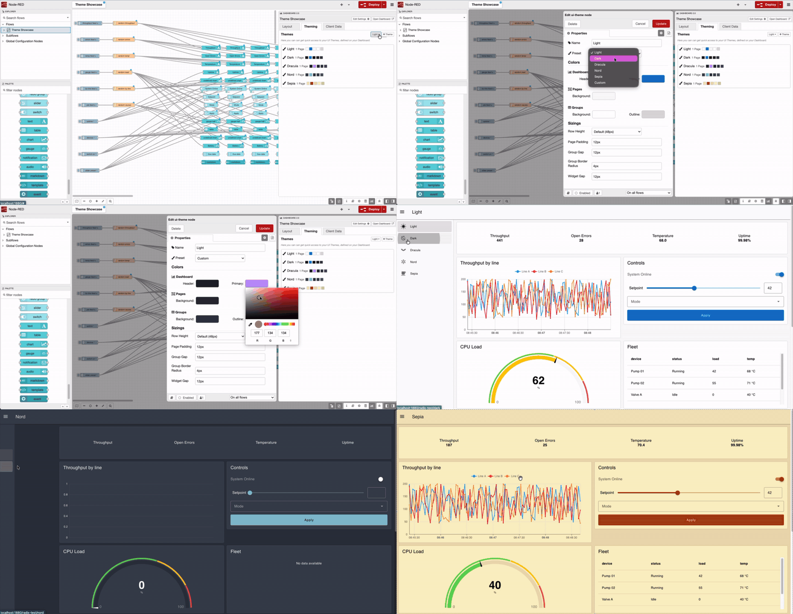
Existing FlowFuse dashboards keep the theme they have. Nothing changes unless you pick a preset, and if you already built a dark mode FlowFuse dashboard by hand, it renders better than it did.
FlowFuse Dashboard charts draw at their default size
Add a chart, leave the size at auto, deploy. You get a chart.
Previously you got a title and an empty box. A chart set to auto height collapsed to a single 48-pixel row, and since a chart has no natural height of its own, it drew nothing at all. The workaround was to guess pixel heights until something appeared and that assumed you'd worked out sizing was the problem in the first place. The empty box gave you no clue.
FlowFuse Dashboard buttons wrap long labels instead of clipping them
A button labelled "Acknowledge compressor fault" now wraps onto a second line instead of being sliced at both ends. Long labels wrap across up to two lines, and anything beyond that truncates cleanly with an ellipsis rather than losing characters from the start and finish of the text.
If your FlowFuse dashboard carries equipment names or fault descriptions, this is the fix you'll notice first.
FlowFuse Dashboard gauges size correctly on auto
Gauges no longer leave a band of dead space above them as the screen narrows, and the card edge no longer slices them off.
Three-quarter gauges size correctly on auto, and the needle dial draws at the right proportions. If you run gauges on a wall-mounted screen, they'll look deliberate rather than approximate.
FlowFuse Dashboard tables show real dates, not raw timestamps
Set a ui-table column to date, time or datetime and it renders as a readable date, formatted in the viewer's own locale.
A timestamp column used to show 1735689600000. Getting a date out of it meant adding a function node to reformat every row before it reached the table — which also baked in one timezone. Formatting now happens in the browser, so someone in Stuttgart and someone in Detroit each see their own local time from the same flow.
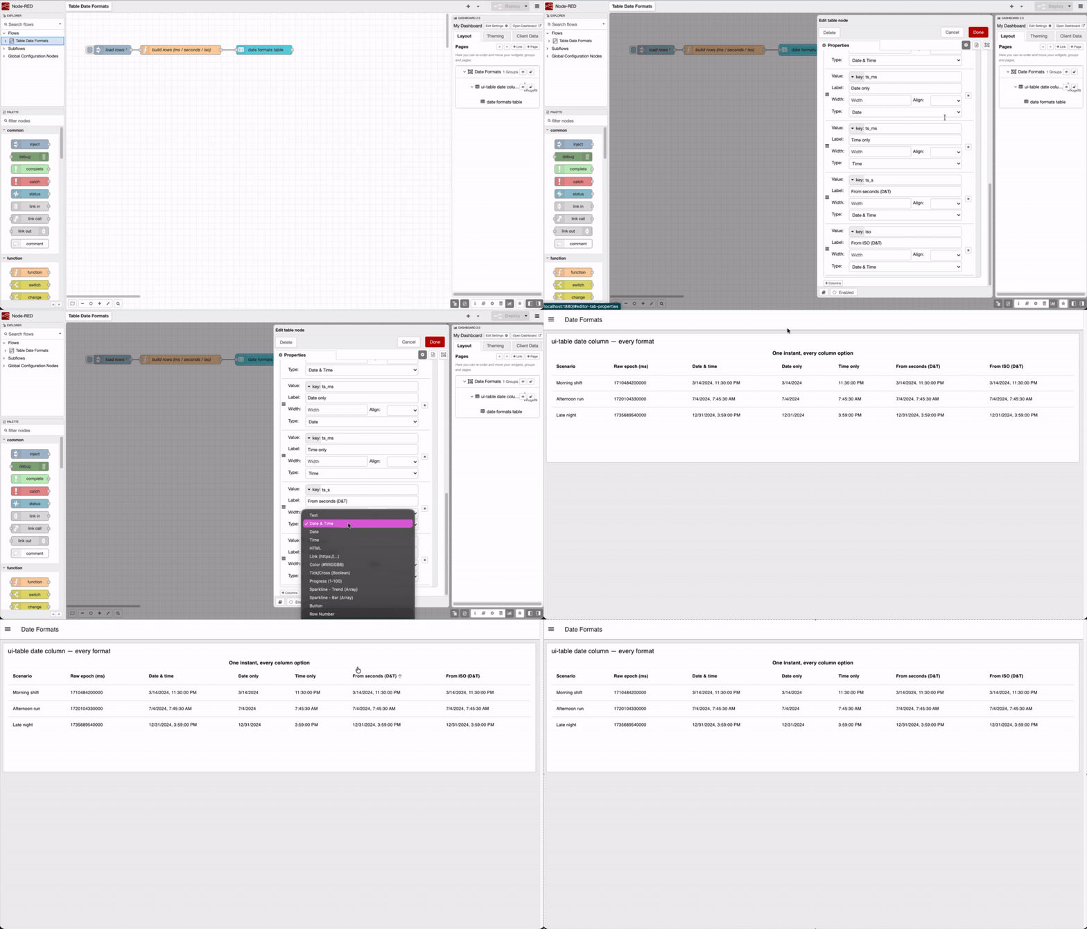
See the ui-table documentation for the column types.
Smaller fixes in FlowFuse Dashboard 1.31.0
- Editing one theme changes only that theme. Changing a colour used to change it on every theme not assigned to a page.
- Tables fill the height you give them. Set a table to a fixed size and it used to clamp to a single row, hiding everything below the first. Now it fills the widget.
- Text input renders correctly as a multi-line text area. It used to render partially.
Thank you to our contributors
This release includes a fix from waldbaer, who solved widget ordering inside subflows (#710). Put a widget in a subflow where the group already held two others and you couldn't position it between them — it stuck to the top or the bottom whatever you did. waldbaer tracked it down and fixed it.
Thanks as well to everyone filing issues with reproduction steps and screenshots. Several fixes above came from reports that included exactly what we needed to reproduce the problem — #151, #1607 and #1772 among them. That saves us hours, and it goes straight into what ships.
Where FlowFuse Dashboard is going
Our goal is that you can build a real operator screen with FlowFuse Dashboard — the kind mounted next to a production line: glanceable, green when things are running, red when they aren't, readable from across the room. Today, FlowFuse Dashboard builds a good data dashboard. It doesn't yet build an HMI.
Two things stand in the way, and they're what the next two releases are about.
The first is that FlowFuse Dashboard is message-driven. A widget shows whatever the last message told it, and shows nothing until one arrives. That's fine on a laptop while you're building. It's a problem on a screen next to a machine, where an operator walks up mid-shift and needs the state of the line right now.
Tags fix that. Define a named, typed data point once, feed it from wherever your data comes from, and bind widgets to it. FlowFuse Dashboard holds the value server-side, so a page renders real state the moment it opens. Tags also carry what industrial data needs and messages don't: a type, a range, warning and alarm limits.
The second is that you can only arrange widgets in a grid. Every widget is a rectangle that flows into rows and columns. That works for a set of charts and readouts. It can't give you a picture of your process: three tanks with the pipes between them, a motor symbol that spins while it's running, a temperature sitting on top of the vessel it came from.
Canvas is a new page type you draw on. Drop shapes and industrial symbols wherever you want them, bind each one to a tag, and set rules like green in range and red out of range.
We're still working out the shape of both, including where tags should live. If you're running FlowFuse dashboards across machines, sites or lines, tell us what you'd bind, what you'd want stored, and what would have to be true for this to replace how you wire data today.
Tell us on this form.
FlowFuse Dashboard 1.31.0 FAQ
How do I change the color scheme of my FlowFuse Dashboard?
Pick a theme from the dropdown — Light, Dark, Dracula, Nord, or Sepia. Every page, group, and widget updates automatically, and existing FlowFuse dashboards keep their current look until you choose one.
Will switching to FlowFuse Dashboard's dark mode break my existing flows?
No. Your FlowFuse dashboard keeps the theme it already has. Nothing changes unless you actively select a preset from the dropdown.
Does this fix apply to self-hosted FlowFuse Dashboard instances, or only FlowFuse Cloud?
Both. FlowFuse Dashboard is an open source npm package that installs into any Node-RED instance, whether you run it on FlowFuse Cloud or your own hardware.
This feature is available to all users from FlowFuse Dashboard v1.31.0, open source under Apache 2.0.
Start building with your own industrial data
Connect your systems, automate workflows, and see what’s possible in your environment.
Like what you're reading?
Add FlowFuse as a preferred sourceOn the page that opens, check the box next to flowfuse.com to see more of our articles in your Google Search results.
Related Articles:
- Visual Layout Editor - Now Available in Dashboard
- Dialogs, Customizable Icons and Histograms Now Available in FlowFuse Dashboard
- New Layout, Widget and Gauges Now Available in FlowFuse Dashboard
- New Charts Available in FlowFuse Dashboard
- Node-RED Dashboard Formally Deprecated