Navigation UI Refresh
We’ve given the top navigation in FlowFuse a visual refresh as part of our effort to constantly improve and modernise the user experience of FlowFuse.
Menus now use a clean white background, with updated colors, spacing, and transitions across the user menu, team switcher, and notification buttons. Mobile menus have also been cleaned up for better usability.
This is the first step in a broader UI modernization effort based on community feedback.
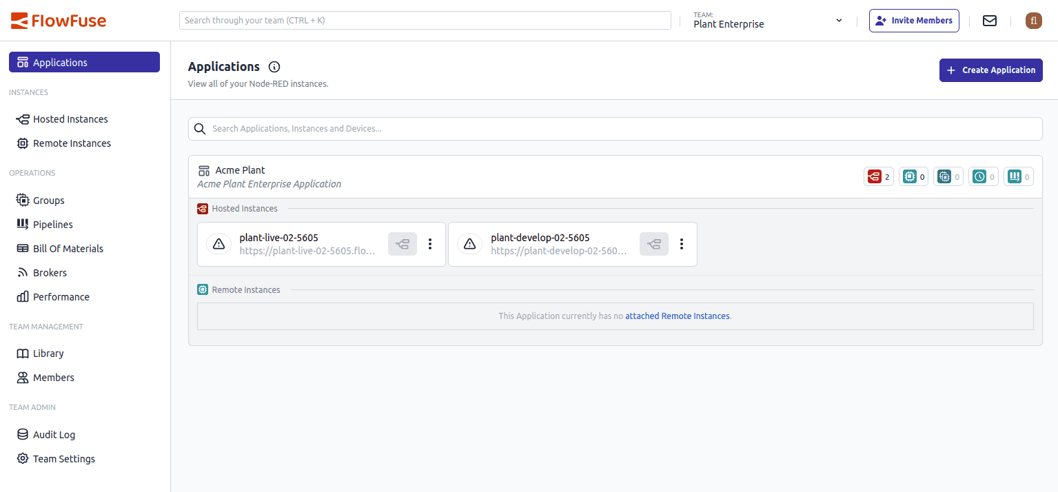 Screenshot of the re-designed top navigation
Written By:
Senior Front End Developer
Published on:
Recent Updates:
- Introducing Remote Agent Plugin
- AI Improvements in FlowFuse
- Vue and Vuetify Editing for Templates
- Expert on Your Team Overview
- Tool Permissions for MCP Agents