Part 3: Building an OEE Dashboard with FlowFuse
Build a responsive OEE dashboard with real-time updates using FlowFuse.
In Part 2, we built the flow to calculate OEE for the production line using simulated production and downtime data and created a dashboard interface for visualization. However, we did not focus much on theme, layout, or styling.
In Part 3, we will focus on improving the theme and design of the OEE dashboard. We will learn how to connect a real data source, adjust fields if your data structure differs, scale the dashboard for multiple production lines, and finally, explore how you can use it to take action based on insights.
Let's get started!
Enhancing the Dashboard Theme and Design
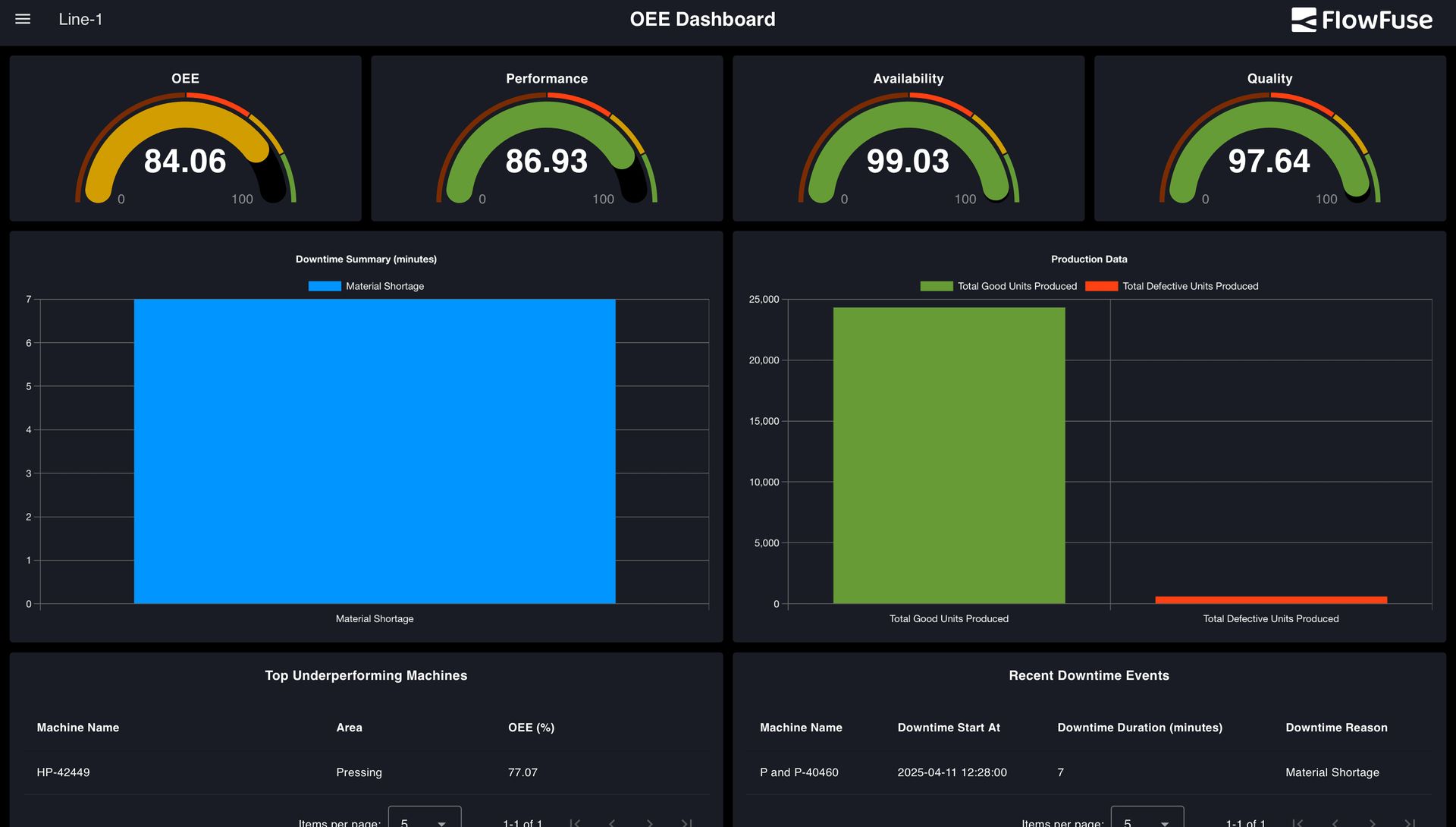
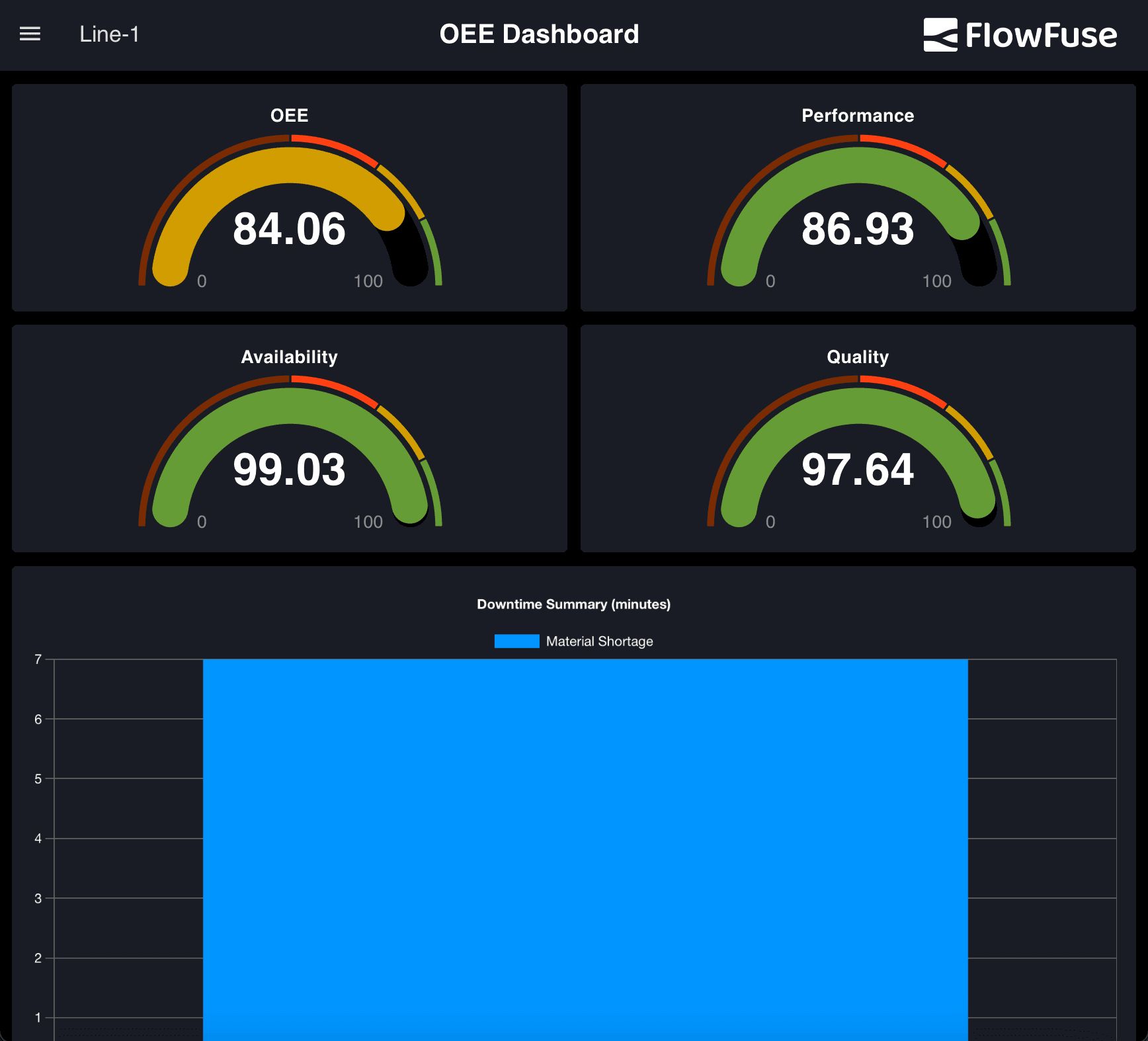
In the planning section of Part 1, we introduced a mockup of the dashboard with a modern dark theme. The theme was built around a sleek, professional aesthetic, using high-contrast colors for readability and a visually appealing layout.
The primary colors in the theme include:
- Black (#000000) — used for the page background to create contrast and reduce eye strain.
- Charcoal Blue (#1A1C24) — a deep, muted tone that adds depth while maintaining a clean and modern look, used for the groups.
- White (#FFFFFF) — used for text elements to ensure maximum readability against the dark background.
- Accent Colors — vibrant colors such as teal, orange, green, yellow, and blue are used across widget elements, including chart bars, line graphs, and indicators. These accents help differentiate data types and bring attention to key metrics.
But how do you come up with a dashboard design like this on your own? It starts with understanding why the theme matters. The design should reflect the context it is used in, the people interacting with it, and the mood it should convey. A dashboard on a factory floor may need to feel bold and focused, while one used by executives might aim for minimal and polished. A hospital system would need a tone that is calm, clean, and highly legible.
If you have a brand palette, that’s a great starting point. If not, choose colors that support the usability and tone of your dashboard. Our OEE dashboard, for instance, was designed for manufacturing teams who need to quickly read live data. The layout needed to be sharp, high-contrast, and low on visual noise—ideal for control rooms with limited lighting. The dark theme helps key data stand out while reducing eye strain over long periods of use.
Modifying Theme
- Open the Dashboard 2.0 sidebar from the Node-RED editor.
- Switch to the Theme tab.
- In the list of themes (you will likely see only the default one), click the settings (gear) icon next to it.
- In the theme settings, click any colored rectangle to open the color picker. You can use the wheel or the dropper tool at the bottom to pick exact colors:
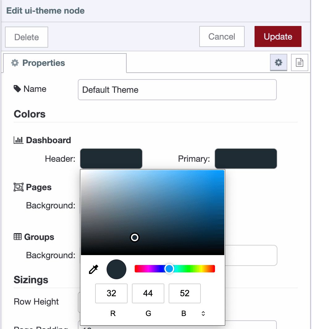
- Set Charcoal Blue (#1A1C24) as the color for the header background, group background, and group outline.
- Set Black (#000000) as the page background.
- Click Update and Deploy Changes.
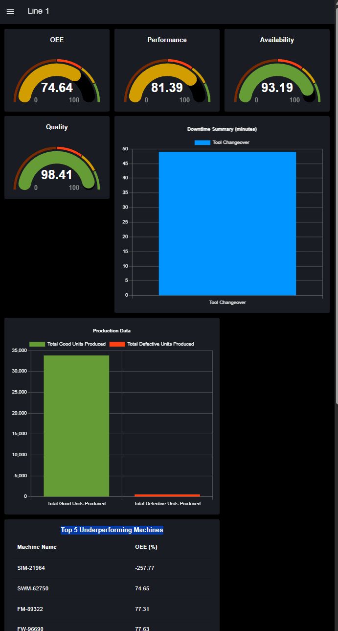
Your dashboard should display the updated dark theme with a clean, modern appearance and improved visual contrast.
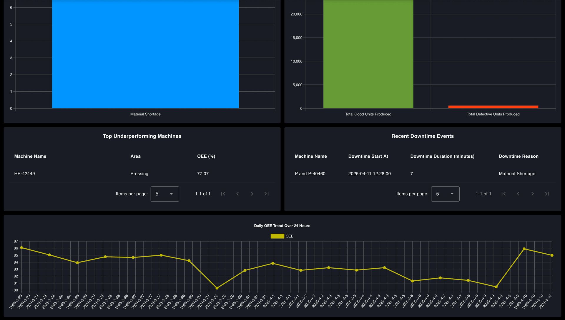
However, additional adjustments are needed to fully align the visuals, specifically the chart grid lines and label text colors.
To update these:
- Double-click on a chart widget to open its configuration panel.
- Scroll to the bottom of the chart config UI.
- Uncheck the following options:
- Use ChartJs Default Text Colors
- Use ChartJs Default Grid Colors
- Set the text color to
#FFFFFF(white) and the grid line color to#606060. - Click Done, then Deploy the changes.
These tweaks will ensure the charts match the dark theme and maintain good readability.
Improving Layout Consistency Across Screen Sizes
When you open the same dashboard on different screen sizes—such as a mobile phone, tablet, or smaller desktop monitor—you might find the layout inconsistent or cramped. For example, widgets may overlap or appear too small.
To make the dashboard truly responsive:
- Open the Page Settings in the Node-RED Dashboard editor.
- Scroll down to locate the Breakpoint Settings Table for different device sizes.
- Identify the Tablet row in the table.
- Notice that the current Tablet column count is set to
9.
Our OEE dashboard has:
- Four KPI widgets (OEE, Performance, Availability, Quality), each set to 3 columns wide.
- A total of 3 × 4 = 12 columns, which does not fit in the 9-column grid—so the layout breaks, and one widget drops to the next row.
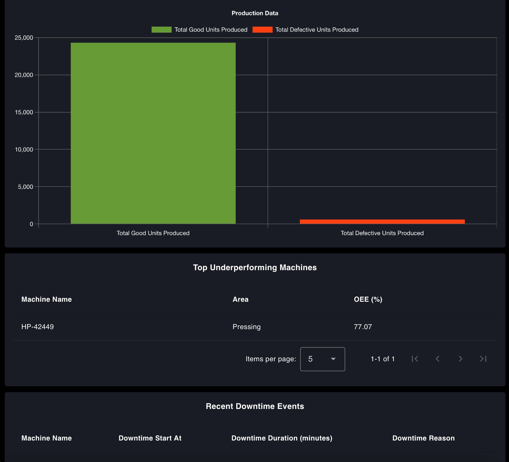
- Other widgets like Production Summary and Downtime Events are each 6 columns wide, which leaves 3 columns of unused space in a 9-column layout.
- To correct this, set the Tablet column count to
6in the breakpoint table.
This change ensures:
- Two KPI widgets fit perfectly per row (3 + 3 = 6).
- Summary widgets span the full row (6/6), making the layout cleaner and more consistent on tablet devices.
- Click Deploy the changes.
Even after adjusting the breakpoint settings, one more issue may appear: inconsistent heights between the Top Underperforming Machines and Recent Downtime Events sections—especially when one of the tables has fewer rows than the other.
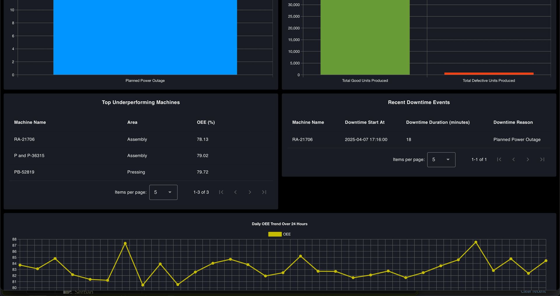
This can make the dashboard layout uneven, with one card appearing much shorter.
To fix this visual imbalance, apply custom CSS:
- Drag a Template widget onto your canvas.
- Set its type to
CSS (all pages). - Paste the following CSS into the template:
.nrdb-ui-group > .v-card {
    height: 100% !important;
}- Deploy the changes.
Adding Header Elements: Logo and Dashboard Title
To give your OEE Dashboard a professional look, add branding elements such as a company logo and a clear dashboard title. These additions improve usability and help users instantly recognize the dashboard's purpose.
- Drag Template widget onto the canvas.
- Double click on it and add the following Vue code to it:
<template>
   <!-- Teleport the title and logo to the #app-bar-actions area -->
   <Teleport to="#app-bar-title">
       <h3 style="color: white; margin-left: auto; margin-right: auto;">OEE Dashboard</h3>
   </Teleport>
   <Teleport to="#app-bar-actions">
       <div style="display: flex; align-items: center;">
           <img
               height="30px"
               src="https://flowfuse.com/handbook/images/logos/ff-logo--wordmark--white.png"
               style="margin-right: 25px;"
           />
       </div>
   </Teleport>
</template>

<script>
   export default {
   data() {
       return {
           mounted: false
       };
   },
   mounted() {
       this.mounted = true;
   }
};
</script>-
Update the
srcattribute in the<img>tag to your logo's path. If you are using FlowFuse, you can host your logo using the static assets service. -
Click Deploy the changes.
We are using Vue’s Teleport feature to insert a custom dashboard title and logo into the top bar of the Dashboard 2.0 layout. For more information, please read our article: Customise theming in your FlowFuse Dashboard.
The dashboard now looks clean, adapts well to all screen sizes, and maintains visual consistency across different UI elements. The header elements have also been enhanced to align with the overall design.
Scaling the Dashboard for Multiple Production Lines
Currently, the dashboard is configured for a single production line. To support multiple lines, you must adjust your flows and dashboard structure to handle each line separately while keeping a consistent layout and theme.
Follow these steps:
- Select the dashboard flow that handles your current production line. Include all relevant change nodes that set values like
msg.quality,msg.performance, etc., tomsg.payload. - From the main menu, hover over Subflows and click Create Subflow.
- Inside the subflow:
- Add an Input node, and connect it to all the change nodes you included from the original flow.
- Reconnect any Link In node (that was previously wired to the change nodes) to the input of the newly created subflow.
- Open the subflow properties, and define environment variables to represent widget groups. In the dashboard widgets inside the subflow, reference these variables instead of hardcoding group names.
- Click Deploy to apply the changes.
This modular approach simplifies scaling and reduces manual work when adding new production lines to the dashboard.
To reuse it for another production line:
- Copy the entire OEE dashboard flow.
- Create a new tab.
- Paste the copied flow into the new tab.
- Rename the tab to match the new production line.
- Create a new dashboard page with the same configuration but a different name and path.
- Open the subflow by double-clicking on it and add a new group for dashboard widgets.
- Go to the configuration flow, and update the line's name to match the new production line.
- Adjust both shift duration values to reflect the new line’s schedule.
- Click Deploy.
Once deployed, you will have a separate page ready for your new production line. You can create as many pages as needed to monitor multiple production lines.
Connecting Your Real Data Source
Now that you have built a complete OEE dashboard using simulated factory data and learned how to reuse it for all your production lines, the next step is to connect it to your real factory environment.
To make the dashboard truly useful in a live setting, you must understand how to integrate it with your data sources. Most commonly, the OEE dashboard relies on static or retained data, such as values stored in a database. First, determine whether your factory uses a relational database like MySQL or PostgreSQL, a NoSQL database like MongoDB, or a time-series database like InfluxDB.
Then:
- Use the Palette Manager in Node-RED to install the corresponding contrib node for your selected database.
- Replace the existing
sqlitenodes in your flow with the nodes for the database you are using. - If using SQL based database, queries may remain unchanged. For NoSQL or time-series DBs, rewrite the queries as needed.
For help, refer to our Database section, which includes guides for MongoDB, PostgreSQL, InfluxDB, TimescaleDB, and DynamoDB.
When connecting to your real data source, you may notice that the field names used in your database differ from those used in the our oee dashboard sqlite node queries. While this seems like a lot of manual work, the dashboard is designed with flexibility in mind. You only need to make two changes to adapt the queries to your schema.
To match your schema:
- Open each database node and update the query to reflect your field names.
- Do not change the alias names — they are used throughout the dashboard.
- Replace table names with those used in your actual database.
- Do not change the dynamic parameters like
$startTime,$endTime, and$line.
Example query:
SELECT
   timestamp as timestamp,
   machine_name as machine_name,
   area as area,
   line as line,
   total_produced_units as total_produced_units,
   good_units as good_units,
   defect_units as defect_units,
   target_output as target_output
FROM ProductionData
WHERE
   timestamp BETWEEN $startTime AND $endTime AND line = $line;
Suppose your database uses different field names, such as time instead of timestamp, machine instead of machine_name, section instead of area, production_line instead of line, produced_units instead of total_produced_units, quality_units instead of good_units, faulty_units instead of defect_units, or planned_output instead of target_output. In that case, you should update the query accordingly. After modification, it should look like this:
SELECT
    time AS timestamp,
    machine AS machine_name,
    section AS area,
    production_line AS line,
    produced_units AS total_produced_units,
    quality_units AS good_units,
    faulty_units AS defect_units,
    planned_output AS target_output
FROM YourTableName
WHERE
    time BETWEEN $startTime AND $endTime AND production_line = $line;
How to Use Your OEE Dashboard
Your OEE dashboard is live. It updates in real-time and shows key metrics. But what should you do with the information?
The dashboard is not just for display—it is there to help you take action. When OEE drops, do not stop at the number. Dig into the cause by checking the three main metrics: availability, performance, and quality.
- If availability is low, check for unplanned stops, long changeovers, or idle machines.
- If performance is down, the line may run slower than expected.
- If quality has dropped, you may produce more rejects or rework.
Say your OEE drops from 82% to 65%, and performance is the problem. Start by checking how many good parts were produced. Look at reject counts—more bad parts affect both quality and output. Then, check downtime logs and machine performance. One or two machines are often behind the drop—maybe they had repeated issues or ran slowly after a setup.
Use the 30-day trend graph to spot patterns over time. A sudden drop might show a specific issue, while a slow decline could signal a more significant process problem. Trends can also help you confirm if recent changes are making a real difference. Finally, share what you find. Use the dashboard during team reviews or shift handovers to keep everyone focused on what needs fixing. An OEE dashboard's real value is how you respond to it.
Conclusion
This final part completes our series on building a real-time OEE dashboard with FlowFuse. You now have a fully functional, visually refined, and scalable dashboard that connects to live production data, adapts to multiple lines, and reflects your plant’s branding and layout requirements.
By the end of this journey, you have built a dashboard and created a foundation for continuous improvement in your manufacturing environment using open-source, low-code tools. We hope this series helped you understand how FlowFuse and Node-RED can quickly prototype and deploy powerful industrial applications. Thank you for following along!
Suppose you have not built your OEE dashboard yet or are facing issues. In that case, you can get started instantly—sign up now and use our ready-made OEE Dashboard Blueprint to accelerate your deployment.
Discuss your use case with our team
See how FlowFuse can support your architecture, integrations, and deployment needs.
About the Author
Sumit Shinde
Technical Writer
Sumit is a Technical Writer at FlowFuse who helps engineers adopt Node-RED for industrial automation projects. He has authored over 100 articles covering industrial protocols (OPC UA, MQTT, Modbus), Unified Namespace architectures, and practical manufacturing solutions. Through his writing, he makes complex industrial concepts accessible, helping teams connect legacy equipment, build real-time dashboards, and implement Industry 4.0 strategies.