New Charts Available in FlowFuse Dashboard
Our most recent update for FlowFuse Dashboard has introduced Pie, Donut and Grouped Bar charts, and plenty more.

It's been a while coming, but we've finally introduced a new set of chart types to FlowFuse Dashboard. We've added Pie, Donut and Grouped (Stacks and Side-by-Side) Bar charts to the UI Chart node. We've also shipped plenty of other improvements and fixes in this release, so let's dive in.
Grouped Bar Charts
We now have the option "Group By" available when building Bar Charts, with the options "Stacks" and "Side-by-Side". This allows you to group data in a more meaningful way, and is particularly useful when comparing multiple data sets.
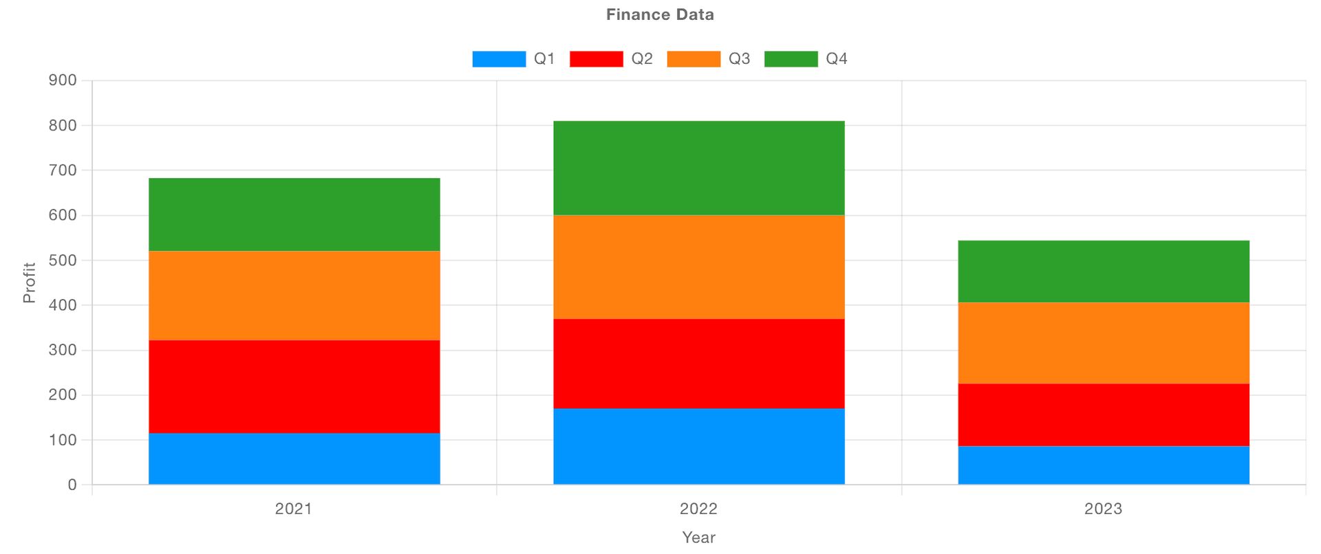
Stacks
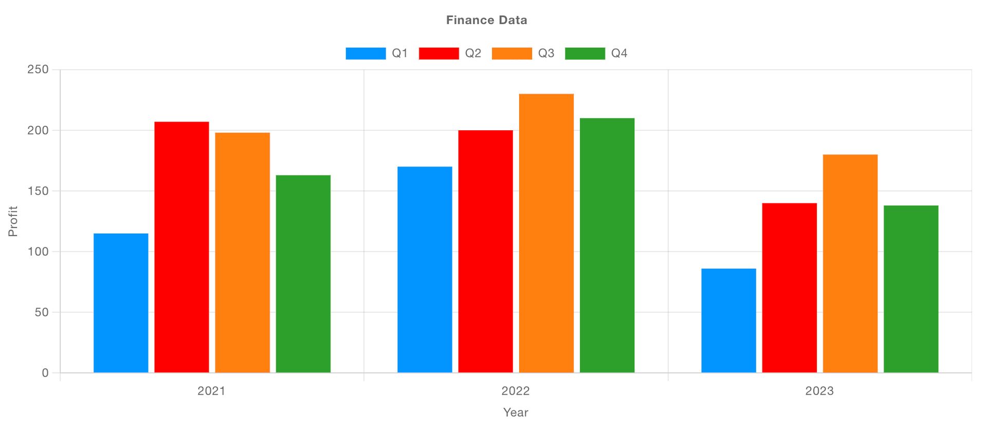
Side-by-Side
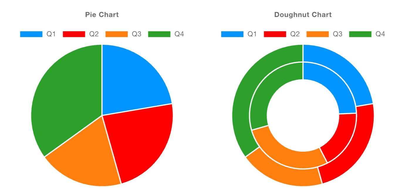
Pie & Donut Charts
Radial charts are now available in Dashboard, with the introduction of Pie and Donut charts. These are particularly useful when you want to show the proportion of a single data set.
If you're using multiple "Series" here, then you'll get multiple nested radial charts, which can be particularly useful when comparing multiple data sets.
General Chart Changes & Improvements
Breaking Changes - Bar Charts
With the introduction of the new chart types, we've generalised the key mapping features for charts. Previously, Bar Charts were using the "Series" property to define how data is rendered onto the x-axis. In hindsight, this didn't really make any sense, it should be the "X" property that defines the data used on the x-axis, so we've corrected that going forward, but it did mean introducing a breaking change. We don't do this lightly, but in this case, it was necessary to ensure the charting experience is consistent across all chart types.
It does however mean that Bar Charts created in 1.13.0 or below will need to be updated to reflect this. You just need to set "X" to whatever you have in the "Series" property, and then set "Series" to "None".
Mapping Your Data
Series
This property is now, consistently, how you want to group your data. If a new msg is coming in, and a property on that msg defines its group, then you can set "Series" to something like msg.myCategory.
If a single data point needs to plot multiple points/bars onto a chart, then you can use the "JSON" type here, and list the different properties you want to plot, one for each category.
For Radial charts (Pie & Donut), having multiple series would provide multiple, nested radial charts.
X
With this, we define which property (or properties if a single piece of data needs to plot multiple points/bars) we want to plot on the x-axis.
Note that on Radial charts (Pie & Donut), this is the value that defines the label of the segment.
Y
Which property should be used to define the y-axis value, i.e. height of the bar or the y-coordinate of a point on a scatter chart.
Note that on Radial charts (Pie & Donut), this is the value that defines the size of the segment.
Example: Plotting Star Wars Character Heights
The Star Wars API is a free, open API that provides data on the Star Wars universe, an example API call can return details about particular characters, and the response is as follows:
[{
"name":"Luke Skywalker",
"height":"172",
"mass":"77",
"hair_color":"blond",
"skin_color":"fair",
"eye_color":"blue",
"birth_year":"19BBY",
"gender":"male",
...
}, {
...
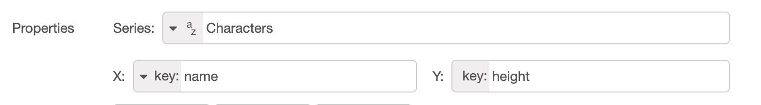
}]We can configure a chart with the following "Mapping" options:
and this would then be the resulting chart:
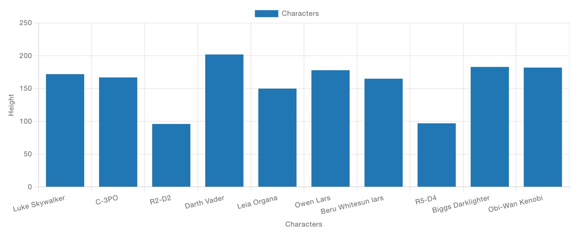
Note, the chart takes in all of the data sent to it, uses the name field to define where on the x-axis the data should be plotted, and the height field to define the height of the bar (the y-axis).
You can read more about this example, and access the flow itself in our documentation here
Live Dashboard Demo
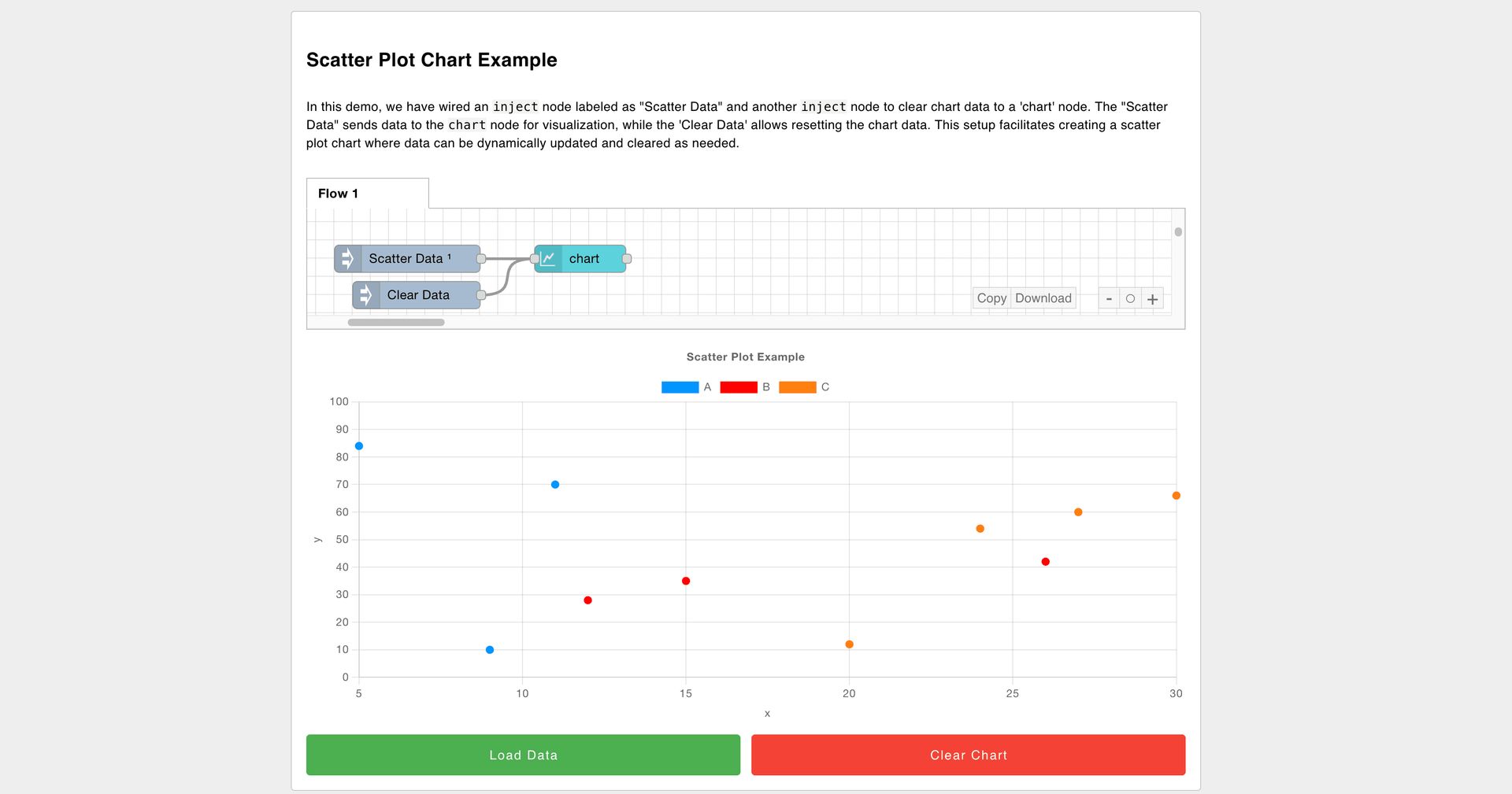
With the new release also comes a new Public Demo Dashboard that we've made available for all to use and play with.
You can try it out, and interact with a range of different chart types, including the new Pie, Donut and Grouped Bar charts. We'll also be extending this soon to cover the full range of widgets available in FlowFuse Dashboard.
If you want more technical detail, you can also check out our online documentation here.
What else is new?
You can find the full 1.14.0 Release Notes here.
Just to highlight a few, particularly valuable, updates and fixes:
- UI Button Group - Now supports
msg.enabledto enable/disable the widget. - UI Form - Now supports
msg.enabledto enable/disable the widget. - UI Button - Color customisation now available, without needing to write overriding CSS.
- UI Switch - Fix missing
msg.topicwhen setting the topic to a static string.
What's Next?
Work has already begun on the next release, 1.15.0, you can see what items we have queued up here, if you've got any feedback or suggestions, please do let us know, and feel free to open new issues on our GitHub
Discuss your use case with our team
See how FlowFuse can support your architecture, integrations, and deployment needs.
About the Author
Joe Pavitt
Joe has been working with Node-RED for nearly 10 years, having worked with Nick O'Leary at IBM as a Master Inventor, and been one of the early developers working on the original Node-RED Dashboard. Since joining FlowFuse in 2022, Joe has become the lead for the FlowFuse Dashboard (Dashboard 2.0), created the Node-RED Academy and leads design and front-end development for FlowFuse.
Related Articles:
- Visual Layout Editor - Now Available in Dashboard
- Dialogs, Customizable Icons and Histograms Now Available in FlowFuse Dashboard
- New Layout, Widget and Gauges Now Available in FlowFuse Dashboard
- Node-RED Dashboard Formally Deprecated
- Multi-Tenancy available for everyone with FlowFuse's Dashboard 2.0